1.2 From Data to Indicator
Introduction to the New Forest
et us take the example of an area of natural parkland, the New Forest in the UK, in which growing leisure use is recognised by all agencies to be a potential threat to the local environment. The precise relationship between visitor numbers and environmental degradation is a complex one and not easily measured. In order to more fully understand the impacts of leisure activity we might therefore need to identify a series of potential, measurable indicators. An example would be to relate environmental pressure by tourists to counts of cars driving into the New Forest itself. The indicator (car count) is relatively easy to set up but it has problems. A day tripper will cause less damage than someone who does not leave the Forest for a week, but both will cause the same ‘car count’.
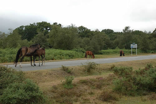
Figure 1: New forest ponies. Courtesy of Raindog at Flickr.com
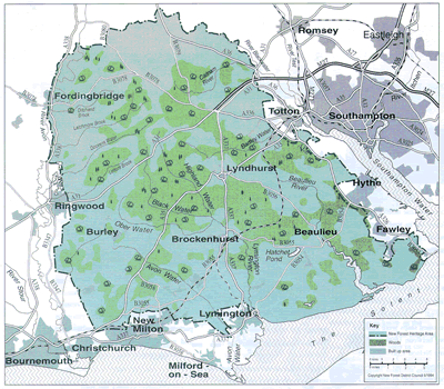
Figure 2: Map of the New Forest
None of these indicators directly captures the process whereby increased visitor numbers may cause physical damage to the natural environment or reduced amenity value but each potentially contributes something to our understanding of the situation and to direct management decisions. If collected spatially, they may allow us to understand the differential impact of visitor numbers on different parkland localities and environments.
Indicators in GIS
A GIS can take many forms and serve many purposes, but at heart it functions by using data to seek meaning and thus support both understanding and decision. Environmental managers could, and in practice often do, function without data – though the conventional view would be that such functioning must be ineffective. So considering the case of the New Forest tourism problem we have outlined above, a New Forest manager could decide to close a car park in an area based on reports that there was a path erosion problem by a river bank. She can do this without verifying that the erosion has even occurred. A GIS, on the other hand, cannot function without data. This self-evident statement is made so that we can start by fully respecting the pivotal role of data in GIS, and then feel free to argue that the data sets that are actually used are frequently sub-optimal and sometimes wholly inappropriate. Continuing the example; our manager could produce a map with buffers around the eroded river bank to prove that the car park she has closed is the closest car park to the bank. That is not conclusive proof that her decision to close the car park is reasonable – the source of the erosion may be tourists following a path from another, further car park. She really needs to relate car parks to paths and then to the eroded area.
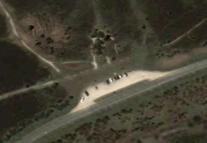
Figure 3: Photo of cars and path erosion in the New Forest. Courtesy of Google Maps
Even under ideal conditions, data collection and management are rarely flawless even if the attributes being measured or recorded are perfectly defined. For example, we could install devices that measure how many walkers stepped on a number of stiles to measure number of walkers moving around a particular area and the results could be analysed spatially using a GIS. It is a ‘hard’ measure but how many children will discover the devices and then bounce up and down on the steps (producing erroneous results) for the fun of it? Conditions are rarely ideal! In practice, environmental managers usually have to make do with ill-defined targets (“protecting the park from erosion”, for example) represented by surrogate data collected historically by diverse techniques and managed to diverse standards. In particular, the variety of individual management needs compared with the constrained availability of existing data and future survey capability mean that individual data sets often have to suffice for a range of specific needs. A study of where tourists have been in the New Forest may be analysed using GIS to decide where new car parks should be built in the future and also identify areas where path erosion may be occurring even though the original study was designed for a completely different purpose. When anything we wish to measure is complex and multi-facetted, and planned uses are highly varied, we tend to seek salvation not in an individual data set for each study but in the notion of the “indicator”.
Like “sustainability”, indicator is a term that flourishes and spreads despite (or perhaps because of!) being ill-defined and loosely used. Of course, formal definitions abound – but the word genuinely is definitions not definition, so for practical purposes such as GIS application design we can fall back on the tradition of operational definition. An indicator can best be defined by understanding how we use it and what we expect it to do for us. The example of the New Forest illustrates something of the challenge that environmental managers often face in finding ways to link high-level policy statements on targets and indicators with on-the-ground practical strategies to be followed with GIS tools. Remember that although we are concentrating on indicators here, the underlying implications in terms of information suitability and quality refer to environmental management data handling in general.
What Makes a Good Indicator?
Indicators are slippery concepts to grasp: They can change with time: A count of walkers visiting an area may have captured the amenity value fully in the past but because mountain cyclers have become a more important users of the resource now it needs to be reconsidered. Spatially indicators vary in quality. The occurrence of a certain species of lichen may be a good indicator of air pollution because it grows badly in polluted air. However, the lichen may also be intolerant of salt as well as of pollution so a measure of lichen growths per square km will not be a good indicator of pollutant-free air in forest areas close to the sea. Indicators also vary according to stakeholder group. Someone living in the forest may complain about coniferous trees dominating the woodland because they can see increasing numbers of coniferous trees from paths and roads around their home area. An indicator based on aerial photos of the whole forest showing that the total area of coniferous forest is actually falling will probably not be valued by them as the ‘truth’.
Our Moral Duty
As Environmental managers GIS gives us enormous power to manipulate data in both senses of the word ‘manipulate’. We can collect, analyse and display data in ways which communicate clearly to stakeholders the ‘truth’ of a study area such as the New Forest. We may also intervene in multiple ways to put ‘spin’ on data – to make it argue a case for a viewpoint we hold dear.
A well known way of manipulating data is to aggregate it temporally or spatially. If we wished to show that grey squirrels were concentrated in one area we could take GPS locations of hundreds of squirrel sightings and view how they appeared if we aggregated them into grids of different sizes (1km, 500m, 250m). We could then pick the grid size that appeared to show the concentration most clearly. Note that we have not tampered with the basic data. Rather, we have just aggregated points together to make it appear in a different way. GIS enables us to do this as the system will recalculate the display for a new grid in seconds whereas by hand the aggregation process could take hours. Aggregating temporally is an even more well known process. Instead of graphing squirrel sightings per day we can aggregate sitings into weeks, months, quarters or years to best illustrate the story we wish stakeholders to believe. We have a clear moral duty to the organisations we work for and to our profession to avoid such practices.
Environmental indicators in GIS are also a powerful tool to manipulate peoples’ opinions: We can use them well to simplify a highly complex situation to one which is much easier to grasp while still maintaining all the important aspects of a situation. We can also use them in a partisan manner to represent our views rather than to illustrate the truth.
Activity
Activity 1
- Using this .kmz file, use the instructions to view the tour of the ‘New forest’ folder. Note that this is not a necessary part of this section and you can click here for an alternative tour.
- Write down 5 indicators of environmental danger from too many tourist visits to the New Forest.
Answer
These might include, the number and occupation rates for local hotel spaces, revenues from car parking, vehicle counts obtained from a roadside survey, information on refuse collection and footpath erosion.
Hide
Activity 2
Read the bullet points on the bottom of page 12 (printed page 5), of the New Forest report. Choose 5 of the general characteristics of a good indicator listed and for each of the 5 think of a specific, imaginary, example of a poor indicator relating the point you have chosen. For example you could choose ‘show trends over time’. The example quoted above of a count of walkers indicating amenity would be poor because increasing use by mountain bikers means the trend over time is not accurate.
Referring to pages 9 – 16 (printed pages 1 – 8) will provide you with the background necessary.
Post your answers to the discussion board.
Activity 3
Pick 3 indicators mentioned in the New Forest report (list page numbers for each one) and discuss ways in which you could use them to manipulate the truth. Choose indicators you have not mentioned in Activity 2 and try and think of different ways of manipulating the truth with each of the indicators you consider. For example, if the lichen mentioned in ‘what makes a good indicator’ was used as an indicator of clean air then we could fail to inform people that it also reacts to salt badly which would mean we could make it appear that the coastal areas of the New Forest are more polluted than they actually are.
Post your answers to the forum.
References (Essential reading for this learning object indicated by *)
*GeoData Institute, University of Southampton (2000) New Forest Heritage Area: Indicators and Monitoring. Report UC370. 106pp.
Background to the New Forest: http://www.newforestnpa.gov.uk/
Definitions of Environmental Indicators: http://www.google.co.uk/search?hl=en&lr=&safe=off&oi=defmore&q=define:Environmental+Indicator
*Influence diagramming: http://systems.open.ac.uk/materials/t552/index.htm
Paper reference, for further reading:
Spatial and temporal ways of aggregating data: “Visual Explanations”, E. R. Tufte, Graphic Press, 1998.