6.3 Analysing Spatio-Temporal Data – Measuring change over time
This part of the module focuses on analytical GIS techniques for quantifying the extent of change over time. Many of these techniques are derived from remote sensing and only a sub-set of the methods available is described here.
Many aspects of environmental monitoring are beyond the scope of this object. Topics such as the design of monitoring networks, handling their changing configuration over time, and distinguishing between natural and anthropogenic environmental change are not considered here.
In assessing environmental change over time, two types of analysis can be distinguished:
- Change detection techniques are used to assess the differences between a pair of map layers, each representing a different time period.
- Time series techniques are used where a ‘stack’ of map layers of a given environmental variable is available, each depicting a different time period.
Change detection – analysing pairs of map layers
The choice of change detection technique depends on the type of data being compared. Quantitative map layers represent variables on an ordinal or ratio scale (these concepts are explained below). Such variables are measured on a numeric scale, such as millimetres of rainfall, degrees of slope, or rank. Any one part of the map layer can be considered to have a higher or lower value than elsewhere in the map layer. For example, a temperature map layer will be measured in degrees Centigrade and some regions of the map will be hotter than others.
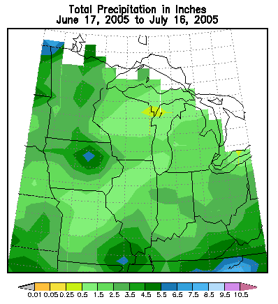
Figure 1: Total precipitation in inches June 17, 2005 to July 16, 2005
Qualitative map layers (also known as nominal or categorical map layers) depict categories. For example, a soils map layer that included soil type categories such as ‘deep peat’, ‘brown earth’, and ‘peaty gley’ are qualitative map layers. The example below has groups of soil type by letters. These categories cannot in themselves be ordered from highest to lowest.
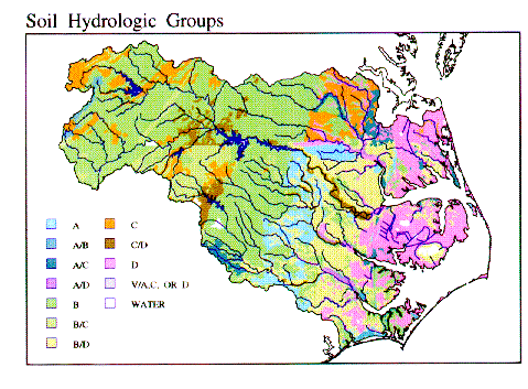
Figure 2: Soil hydrologic groups
Map layers showing quantitative data from two different times can be compared on a pixel-by-pixel basis using either image differencing or image ratioing. The difference between the two map layers as a whole can also be summarised by using, for example, the mean difference, overall ratio, or correlation co-efficient.
Time series analysis
A time series is a ‘stack’ of map layers, depicting the same variable over different time periods. For example, a series of maps of monthly temperature would constitute a time series. Clearly, pairs of images from a time series – such as those for the first and last periods of study – can be analysed using change detection techniques. However, there are also techniques that can be used specifically with time series.
Time series have many properties that are not apparent in pairs of map layers from different times. These properties include:
Long-term mean and standard deviation: For any one pixel on the map, we can calculate the long-term mean and standard deviation of that pixel’s values through time. The long-term mean provides a measure of ‘typical’ conditions for a given pixel, whilst the standard deviation indicates how variable conditions are for that pixel. Thus, if we calculate standard deviations based on a time series of daily cloud cover, the pixel with the higher standard deviation will show more variation in cloud cover from one day to the next.
Temporal autocorrelation: in the same way as neighbouring features on a map may have similar characteristics, so consecutive time periods may share similar characteristics. This is known as temporal autocorrelation. Temporal autocorrelation is a useful property of a time series, because it indicates the extent to which future changes can be predicted. For example, it is likely to be easier to predict next week’s precipitation for a pixel with high temporal autocorrelation, than for one with low temporal autocorrelation.
Periodicity: Many environmental time series are cyclical in nature. In most regions, rainfall and temperature follow both annual and daily cycles.
Trends: A systematic change may occur in data over time. Identifying such trends is particularly important when assessing the effects of climate change on properties such as hours of sunshine or air temperature.
Correlation with other time series: One time series may vary in line with changes in a second characteristic – for example, temperature may vary in line with cloud cover (see below).
Mapping these properties by pixel, point or polygon can provide useful insights into an environmental time series (see Malhi and Wright, 2004). Using such properties to summarise a time series can also be a useful first stage before conducting further analysis. For example, such properties could be used to delineate climatic zones. Properties such as long-term variability in precipitation or the magnitude of seasonal variation can also be compared to species abundance data. This can be easier than attempting to analyse species distributions in relation to the ‘raw’ monthly climate data.
Some tools for creating summary measures from time series are available in most GIS software. In Idrisi, for example, the CORRELATE tool enables each pixel in a time series ‘stack’ of raster grids to be correlated with a single time series. For example, a series of grids depicting precipitation across South America could be correlated with values of the Southern Oscillation Index. The Southern Oscillation Index (SOI) is calculated from the monthly or seasonal fluctuations in the air pressure difference between Tahiti and Darwin. However, in many cases, a GIS analyst may have to resort to writing their own software or purchasing specialist software packages to calculate such summary properties.
Many time series data sets are interpolated from sample data points. Precipitation and temperature data, for example, are frequently interpolated from ground measurements taken at meteorological stations. For such data sets, the GIS analyst is faced with two options:
- Interpolate data for each time period to a raster grid and then estimate time series properties for each pixel or;
- Estimate time series properties for each meteorological station and then interpolate properties such as trends afterwards.
These two approaches frequently give different results and it may be necessary to use both approaches.
Activity
The Kappa Index of Agreement
View the animation below, which introduces the Kappa Index of Agreement.
Next, download the Excel file, which explains how to calculate the Kappa Index of Agreement from some land cover data. Although GIS packages such as Idrisi will calculate Kappa, it can be useful to know how to calculate the index manually.
Finally, if you are using ArcGIS Desktop download these GIS data files and follow the practical instructions. If you are using ArcGIS Pro, please download this zip file to complete the exercise. This activity involves comparing land cover maps from different years for an area within Zimbabwe.
References (Essential reading for this learning object indicated by *)
For an example of time series analysis using GIS, see: Malhi, Y., and Wright, J. A. (2004) Spatial patterns and recent trends in the climate of tropical forest regions. Philosophical Transactions of the Royal Society, Series B – Biological Science 359, 311-329
You can find out more about the scenario used in the GIS activity above in these articles:
Mapedza, E., Wright, J. A., and Fawcett, R. (2003) An investigation of land cover change in Mafungautsi Forest, Zimbabwe, using GIS and participatory mapping. Applied Geography 23, 1-21.
Reid, R. S., Wilson, C. J., Kruska, R. L., et. al. (1997) Impacts of tsetse control and land-use on vegetative structure and tree species composition in south-western Ethiopia. Journal of Applied Ecology 34 (3), 731-747