
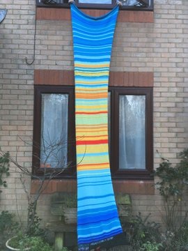
The data visualisation competition we ran for Love Data Week 2020 inspired me to use local temperature data to knit a blanket charting the daily high temperature for every day in 2020.
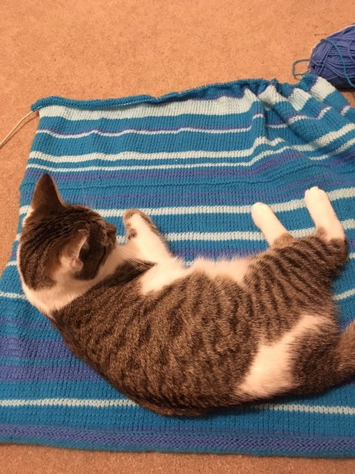
I decided which shades of yarn to use for each temperature band and sourced data from accuweather.com for my local area. I knitted 1 row and purled 1 row per day, except for the first day of each month which is 2 knit rows (to create a ridge) so you can see where each month starts. This resulted in a blanket ideal for a tall, thin giant so I added buttonholes to the end and sewed chunky buttons to the top so it can be doubled over and made a more manageable size.
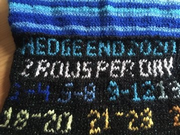
I wanted the blanket to make sense to anyone looking at it, so added in data descriptors at the bottom.
I am resisting starting another project using 2021 temperature data, although I do like the idea of a scarf. A Google search suggested a blanket recording a person’s weight every day for a year but I am not in the slightest bit tempted by that.
Find out more about research data management at the University of Southampton, including planning, storing and sharing your data.
such beautiful and creative work, Nicki!