It is time to devise a logo for MoreThan TALK. If we had more time and greater resources, we could have commissioned a designer to work up some ideas and then complete market research on it. We had neither, so first stop (and a complete short cut!) was to visit www.freelogoservices.comwhich is a site that will take a name and a theme and create pages of possible logos. In fact, there were 10 pages of logos, 20 logos to the page. A huge selection of frankly largely unsuitable designs.
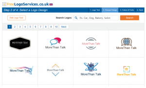
We quickly settled on two.
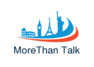
The first was a logo with an eye-catching shape. Compared with many social network logos (see earlier blog) it would probably be considered rather fussy.
The software delivers a vanilla font, so we amended the font to something with a little more style.
The text became a slightly larger element of the overall design. However, on reflection the logo has a western/European bias featuring as it does the Colosseum in Rome, Big Ben in London, the Eiffel Tower in Paris and the Statue of Liberty in New York. If MoreThan Talk is to reach a world-wide audience, then the logo would need some images eastern and southern hemisphere locations (Taj Mahal in India, The Forbidden City in China or Sydney Opera House in Australia – and we are still completely missing south America and Africa).
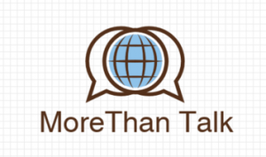
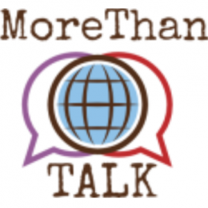
The other image was a generic image of a globe.
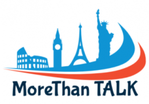
Using the online editing tool this gained some colour and a different treatment of the text.
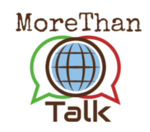
A final discussion of coloured and text types and we ended up with the following.
Not perfect and something that would benefit from a designer’s eye, rather than a machine’s algorithmic mix and match. Still, it gives us something to use for the time being.
No comments yet.