Having settled on the name ‘MoreThan Talk’ we will need to devise a logo or symbol so that among all the competing social media icons stands out. With this in mind I went searching to see there were any examples of ‘MoreThan Talk’ iconography on the Web. Pleasingly there are only a couple of examples where word for word the term is used (and neither of them refer to a social network).
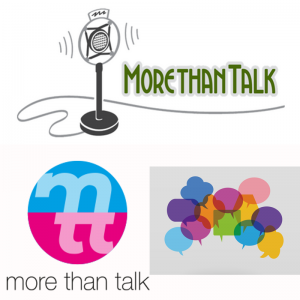
The top image with the retro microphone would be entirely unsuitable for a social network. It is too complex, rectangular (all existing icons fit a square) and it demonstrates yearning for a bygone age.
The circular logo is an interesting use of the letters m and t&t. The colour scheme is not offensive. So if we were to do something similar it could be developed into unique imagery.
The bottom right image of overlapping speech bubbles appeared following the search. Again, it could give some direction to the design process. The idea of multiple different voices talking could be a useful idea to take forward.
Image information:
Top: http://rexosborn.com/wpr/
Bottom left: http://morethantalklondon.org
Bottom right: https://www.saba.com/blog/feedback-as-a-learning-tool-it-takes-more-than-talk
No comments yet.