Social Media Logos
Visual Identity
What ever we end up calling our social network, we will need to develop a strong visual identify. The name itself will form part of that identity, but there does need to be some visual association of the name with something that users recognise such that it becomes familiar.
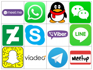
As a thoroughly non-academic exercise I have selected a dozen well known (and lesser known) social media logos – to help us ‘doodle’ what our design statement could be.
First some general comments. While most social media logos stick with a very strong simple image of a dominant colour (Facebook’s blue ‘F’ or Google+’s red G), there are a wider variety of logos evident. The logo themselves may be rendered in a wide variety of ways – which could be the topic of a future blog. Here the majority are placed in squares. It is just as possible to locate them in a circle, hexagon or even without any boarder just allowing the central image to ‘float’. These may go against the official style guides of the social media corporations, but on the internet designers develop, adapt and adopt company logos at will.
All comments about the logos are personal. (We are working from top left to bottom right)
- Meet me – in a purple lozenge and containing a smilie face within a speech bubble. This effectively commutates that this site is for social connections and meeting friends. Breaks the trend of having a logo that comfortably sits within a square which has the effect of reducing the impact.
- WhatsApp – a green logo containing a speech buble with a telephone handset. The company is owned by Facebook but does not give this away through any colour association. The app provides messaging and VoIP capability.
- QQ – more properly known as Tencent is an instant message (chat-based) platform coming out of China but available across the globe. Culturally the cute penguin may not work well in this country with anyone over the age of 10!
- WeChat! – also developed by Tencent is a network with similar operability as WhatApp. The common colour of the logo cannot be a coincidence. The twin speech bubbles with eyes is an effective visual message about the apps purpose.
- DeviantArt – this abstract design was worth consideration as it is not immediately clear how the logo design points to this art sharing social network.
- Skype – a social network for chat and VoIP calls, it currently hosts over 40% of the international calls market. A very recognisable logo but without a direct link to the service the network provides, except perhaps international calls go through the clouds?!
- Viber – over 250 million users make use of this communications application. As the logo suggests the communication can be over telephone handsets, but the site also supports messaging and the sharing of images and videos. A rectangular logo. Does the fact that it doesn’t sit comfortably sit within a square reduce its use?
- Line – another global social network for sharing voice and text messages across the globe. A simple clear logo (in ubiquitous green) of a speech bubble with the word LINE inside it.
- Snapchat – who are you going to call? The ghostly logo is about the ‘did you see it’/’now its gone’ feature of the Snap’s app which removes messages, images and videos after they have been viewed.
- Viadeo – a social network for business people with a grown up logo. Though the name and logo give little away about what the network is offering.
- Telegram – over 100 million people use Telegram each month. From the outset it was a communications network for people who wanted to send encrypted messages and have an instant deletion of the messages. The use of a simple paper aeroplane does not explain the service nor reflect the name. That said it is easily recognisable.
- Meetup – this social media network has seeks to draw people with similar interests in a similar location together. The logo is the name and the lozenge makes it stand out from the crowd.
Conclusions
The world’s most popular social network sites generally have very simple dominant coloured logos that can be presented within a square or circle (or hexagon or…). I am not sure that there is sufficient creativity for another logo involving a speech bubble, a cloud, a simple face, blue or green. I think our task is to try and come up with something original away from the popular memes.
Reference:
The collection of logos was gathered from blogger Jamie’s page on makeawebsitehub.com
No comments yet.