The brand logo is the first thing that customers will think of when it comes to identifying brand. The logo represents as an identification badge, as a way to expand an enterprise’s name and as a mark of quality. Furthermore, if a logo is managed and created properly, it may result in generating competitive advantage and facilitate the task of formal corporate communications. The name of the company, logo, colour scheme and typeface are considered as the main components of corporate visual identity (CVI). Van Riel and Van den Ban pointed out the difference between the intrinsic properties of logos and extrinsic properties. Extrinsic properties are those creating from association with the organisation. It can be represented by an illustration of Nike which has powerful referential elements – they use the Swoosh standing for movement. The logo of Nike has low representativeness but high level in extrinsic value. Even though the power of extrinsic properties is high and the degree of realism in the design is contrary related to the ability to attribute additional meanings, only little studies examined whether abstract design or illustrative design is more suitable to particular companies.
Another point worth mentioning is logo colour due to its mnemonic quality in the areas of recall and recognition. Colour can play a significant role in informing information, generating lasting identity as well as advising imagery and symbolic value. According to research from WebPageFX a web design and marketing company, people judge about a product subconsciously in less than 90 seconds of viewing, and most of them base their assessment on colour alone. Moreover, nearly 85% of consumers refer colour as the primary reason when they buy products. In fact, 80% of consumers believe that brand recognition can be increased by colour.
 (Fast Company, 2018)
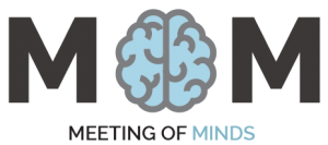
Meeting of Minds logo uses blue as the main colour because blue can result in a calming effect for whoever sees it. Naturally, blue is typically associated with the sky and the coolness of the sea which has an impact on calming the sense and lower blood pressure. Some claim that blue may stimulate a feeling of security, trust and cleanliness. In terms of marketing, blue is frequently used in cooperate business because it is productive, non-invasive and can create a sense of trust and security in a brand. For Meeting of Minds, blue is the perfect colour not only for the logo but also for our site since we are concerned about user’s privacy and security.
Our logo is created and designed as a combination mark ( a pictorial mark with a word mark ) due to the amount of versatility that a combination mark offers, it is easy to catch the eyes of specific groups in which the service or product aimed. With a combination mark, the brand will be reinforced. Using a combination mark will allow people to associate the name of the brand together with the pictorial mark straightaway. Furthermore, this combination can generate a distinct image which makes logos are easier to trademark than using a pictorial one alone.

Ref:
Fast Company. (2018). What Your Logo’s Color Says About Your Company (Infographic). [online] Available at: https://www.fastcompany.com/3028378/what-your-logos-color-says-about-your-company-infographic [Accessed 1 Apr. 2018].
Morones, H. (2016). Do you know the 7 different types of logos?. [online] 99designs. Available at: https://99designs.co.uk/blog/tips-en-gb/types-of-logos/ [Accessed 2 May 2018].
Amasci Creative Limited. (n.d.). Professional Logo Design & Branding. [online] Available at: http://www.amasci.co.uk/services/logo-design-branding/ [Accessed 1 May 2018].
Hynes, N. (2008). Colour and meaning in corporate logos: An empirical study.

 (Fast Company, 2018)