Privacy or the lack of it?!

twitter-292994_1920

Privacy and mass surveillance are one of the biggest issues that have emerged (RIFON, N. J., LaROSE, R. and CHOI, S. M. , 2005), with the rise of densely connected digital world and specifically social media platforms gathering personal data with user’s own consent.

The balance between state surveillance for safety and personal privacy is a tricky mission to accomplish: studies show that public opinion splits into those who agree that it is ok to collect data for national security and others highly disagree. There is a strong debate going on about what is appropriate in terms of interfering with personal data environment.

Video 1. Wiretaps, data dumps and zero days: is digital privacy no longer possible?

Zero-day vulnerability is another big issue, that is why we take our testing and deployment very seriously. That said, there are always risks associated with any digital product: software engineers are humans and cannot foresee all the gaps in the code, so hackers might be successful in finding the backdoor even in the best of products.

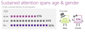
Also, we realise that consumers attitude towards privacy on the web can be controversial, whereas Privacy fundamentalists are roughly 25% of the represented sample with the rest being deliberately neglectful or ignorant of the way their data is being used by online services (P. Kumaraguru and L. F. Cranor, 2005). Millenials (our target audience) deliberately trade off their personal data to build up their digital identity and gain some value in return. They have not as much concern about disclosing their information as with having a chance to control that disclosure with certain privacy settings.

Nevertheless, we believe that privacy in the modern age is the essential public good which has to be protected no matter how difficult and technically challenging that is.

Prevention and Transparency

There are two ways that privacy issue can be dealt with: Prevention of personal data being available to third parties and Transparency of how data is being used. As we have talked in previous posts, in terms of transparency we are determined to protect personal data under current legislation and also provide clear consent forms to our users stating in simple terms what will be done to their data (analogy with Creative Commons human-readable layer of the license agreement). We will respond to government data requests similarly to Facebook and will provide transparent statistics for any user to look up.

As for the Prevention, we will use end-to-end encryption models for the messages being transmitted through our app. We will try to overcome the issue of offline messages being reassigned with another key which gives a loophole for hacking. Our team will not pronounce it as a feature of the app like in Whatsapp case, but we will treat it as a bug which needs a fix.

By transparency and data protection policy combined with straightforward agenda, we provide the context for our users to consider and make a weighted decision regarding their personal data sharing.

References:

P. Kumaraguru and L. F. Cranor. Privacy indexes: A Survey of Westin’s Studies. Technical report, Institute for Software Research International, Carnegie Mellon University, December 2005

RIFON, N. J., LaROSE, R. and CHOI, S. M. (2005), Your Privacy Is Sealed: Effects of Web Privacy Seals on Trust and Personal Disclosures. Journal of Consumer Affairs, 39: 339–362. doi:10.1111/j.1745-6606.2005.00018.x

Mockups and Prototypes

App product teams need mockups to present their vision and views of the final product and that is why here, in NaviGap, we use top tools to present best UI solutions.

In this post, we will present our mobile screen mockups to show the basic functions of our outlined scope.

Why prototype

No secret, that there is no perfect User Interface which will be explicit, intuitive and efficient for all users. However, close to perfect is possible and achievable with countless efforts, many hours of work and constant improvement. Thinking and interacting with your app just like your user is the key. A prototype is not a final product, it is the field for improvement and work. It starts with simple sketches and gets augmented by adding features, links, interactions, design improvements on its way to perfection. Prototypes allow prototypes allow us to test the feasibility and usability of our designs before we actually begin writing code. They allow to actually test and play with various user interactions scenarios.

Imagine

Sketching an app helps to ‘feel’ the actual thing and maximise ideas if only on the paper. Various techniques from pencil sketches to post-it notes dashboard can be used. We used a simple sketch to get the whole picture and then moved to available prototype tools to implement click-throughs interaction.

mock

Figure 1. A sketch of what we wanted

Click-Throughs

Then, we used JustinMind software to build our prototype and show our user interactions with it.

Here is the basic interaction map:

Picture1

Figure 2. Interaction map

Figures 3-6 show the initial set of Navigap screens simulated on iOS. Interactions are listed according to user action and marked with blue circles.

   Picture2

Figure 3. ‘Main_screen_feed’. Main screen with latest expert feed

Interactions:

4 on Click:   goes to ‘Q&A_with_experts’ with effect: pop

5 on Toggle:   goes to ‘Location_on_map’

6 on Click:   goes to ‘Expert_story’

7 on Click:   goes to ‘Expert_story’

8 on Toggle:   goes to ‘Location_on_map’

9 on Click:   goes to ‘Q&A_with_experts’ with effect: pop

Picture4

Figure 4. Q&A_with_experts. Interaction with expert users

Interactions:

2 on Click:   goes to ‘Main_screen_feed’


Picture5

Figure 5. Expert_story. Extended travel story of an expert user

Interactions:

1 on Click:   goes to ‘Main_screen_feed’

Picture3

Figure 5. Location_on_map. Extended map of chosen destination

Interactions:

1 on Click:   goes to ‘Main_screen_feed’

The interactive simulation can be accessed via the link: https://www.justinmind.com/usernote/tests/25458829/25462335/25465092/index.html

Final thoughts

We understand that our highest priority is the user and making their experience pleasant and fun in lines with our goals is a challenge. However, using different approaches, tools and techniques to reach the ultimate App prototype is something we take seriously within our team.

Agile versus Waterfall

        main-qimg-58816439e3c075a5b8bebbba6131cf5b-c

Figure 1. How Projects Really Work

In this post, we would like to discuss how we envision our development process philosophy and which approach we plan to use. As can be seen in Fig.1, the vision of a project is not always the same (completely different) to its final release. Thus, it is very important to choose the appropriate development strategy and stick to it during the project’s lifecycle to deliver the best solutions.

Different approaches

In the case of web development process, there are generally two approaches: waterfall and agile. What are the main differences between them?

  • Waterfall process is when each part of the project is done sequentially by a team member and passed along the assembly line after the part is finished.
  • Agile process is a simultaneous working approach when each member of a team contributes to the project in the same time frame.

In short, here is a simple explanation of both:

 Video 1. Workflows: Agile vs. Waterfall

After considering the pros and cons of given approaches, we chose the agile model for the following reasons:

  • Short iterations (time frames) of development work mean fast delivery and constant up-to-date with current issues. Our product is for young and innovative people and we need fast solutions for emerging problems, and small increments of work provide convenient development pace for our product.
  • Our small team has representatives from all stakeholders, so conducting Scrum meetings would be an efficient collaborative process where interests from each side are not neglected.
  • Feedback is prompt and corresponds with each iteration directly.

Q. How does it work on a daily basis?

A. Scrum Power!

Video 2. Short explanation how Scrums work

We will be using the Scrum Agile methodology as it has proved to be effective and applicable to various project types.

Basically, each of our sprints (a specialized term for iterations) will consist of several steps:

  1. A product owner  –> creates –> a to-do list with noted priorities which is a product backlog.
  2. The team –>takes–> a small piece of that to-do list from the top, and discusses implementation.
  3. Our sprints –>last–> 3 to 4 weeks to complete that piece.
  4. Meanwhile, the team—> has –> daily scrum meetings to discuss and assess the progress of work to be done.
  5. The ScrumMaster —>is–> the master brain behind those organised scrum meetings. They keep the team aligned and focused on the goals.
  6. Each sprint —>ends —> with a deliverable product, thus showing an achieved goal to a stakeholder.
  7. A sprint review and retrospective —> complete the cycle of each sprint and maximise the feedback effect in order to improve a next sprint delivery.
  8. A new chunk of backlog is taken into work and the iteration cycle starts from Step 1.


In our vision, Scrum is a flexible and efficient web project management framework which enables the team to react more quickly and respond more accurately to the arising issues. Scrum’s holistic nature minimizes marginal risks and allows our App product to adapt to changes just in the right time.

NaviGap UML diagrams

In this part, we will talk about our development model views described in Unified Modelling Language. UML is a language which we will apply to describe use cases meaning the interactions of an actor (user) and a system to achieve certain goals. This is an in-between process: after we gathered all requirements and shaped our agenda and before we actually started coding.

Our app users

In previous posts, we identified our user personas. Now we can proceed and implement those personas into our interaction use cases. It helps us to identify the functionalities we want to offer to them. We don’t have to cover now the scenario of a registered or authenticated user, but we will treat as a seperate diagram.

Our app functionalities

Now we identify general functional blocks we offer for the actors (personas) aligned with activities they perform.

The First Persona is identified as a novice who comes for social value and expert advice. is clearly interested in

The Second Persona is an expert who was a novice at the beginning, but after a certain amount of contribution (posts, advice, photos etc.) became an expert (high degree of centrality) and can provide help/advice/guidance to novices.

Finally, the Third Persona is a commercial partner type of user who is interested in business add-on value.

Three iterations are needed to reach the outlined use case scope.

Figure 1. Use Case Diagram: NaviGap interaction

At this point, we can augment the Persona 1 case by expanding each functionality. For example, ‘Seek travel inspiration’ functionality:

Figure 2. Use Case Diagram: Augmented functionality

Through each augmentation iteration, we ask ourselves: is it enough? have we listed all possible functionalities that we can release? Step by step we will augment our UML layout and add blocks to each functionality. After each functionality has a detailed list of sub-functionalities we can look at it critically and think of additional features that will give us a competitive edge.

Our app communication diagram

As an example of UML communication diagram, we show the scenario when a user wants to login into their account. That provides a model-view-controller perspective of interaction.


Figure 3. Communication Diagram: Login

Our app state diagram

State diagrams can be seen as the essence of object-oriented programming (OOP). Those diagrams are good when we want to describe the behavior of a single object. In general, those diagrams define various states of an object during its life cycle.

A state diagram represents the actual changes in state, not the particular processes/commands creating those changes.

Figure 4. State Diagram: Novice User object


Why we need all those diagrams?

We assume that our team should have a clear understanding how the users interact with the App, what functionalities we are planning to offer to them and in what way they can access them. Overall, each diagram builds up a clear understanding of what is expected from the app, what role the users and other actors play in it, and helps to shape the outline of the UI design.


Model-View-Controller framework

When choosing a system architecture design framework for our app, we picked the Model-View-Controller model and we will explain the reasons behind that.

Historically MVC was the earliest example of Graphical User Interface design approaches since its introduction by Trygve Reenskaug  MVC into Smalltalk. It solved the problem of user control over large data sets. The idea was to create an illusion for the user that they control the data domain.

Screen Shot 2017-03-20 at 10.53.53

Figure 1. The original concept behind MVC

 Although originally developed for desktop software, MVC became largely popular for web/mobile applications architecture design.

What does MVC mean?

Model is the knowledge domain.

View is the visual representation of the model.

Controller is the link between a user and the system. Provides means for user input and produces means for user output.

MVC-basic

Figure 2. Basic MVC interaction diagram

This structure splits the architecture of an app into three interconnected parts, so that the internal representation of information and user representation of information can be separated.

For example, we can look at the Web from the MVC point of view. The model is HTML that communicates the knowledge to a user. The view is a CSS that makes the information readable and nicely represented. The controller is a browser that renders the HTML and CSS and produces an output and translates the user input into script code. From the evident statistics of the Web usage, we can conclude the MVC model works fine.

The pros of MVC

  • Simultaneous development. Because the components are separated, different teams can work with different components of an app without blocking the work of others. For example, development can be divided into back-end and front-end, whereas the latter do not need the server-side data structure to design the user interface and vice versa.
  • Reuse. Again, because of independent components, the components code can be easily reused in other applications.
  • Multiple views of a model. New features and business entities can easily fit into an existing pattern.

The cons of MVC

  • Learning different techniques. Developers have to be skilled in different technologies and multiple coding techniques.
  • Complex design pattern. Although the main concept is quite straight-forward, the structure of each component can get very bulky and complex.

We conclude that the MVC design pattern is aligned with our design and development core.

Screen Shot 2017-03-20 at 10.47.26

Figure 3. The NaviGap MVC design pattern

We have chosen to use Django python web framework because it is open-source, free and is targeted at highly-loaded database-driven applications. Django web framework is viewed as an MVC architecture. The Model is an object-relational mapper assisting connection between data python classes and a relational database. The View is a system processing HTTP requests and the Controller is the URL dispatcher. Also, we will be using AngularJs to extend the capabilities of declaring dynamic views in our mobile app.

In short, we have a layout of planned works to be done.

Process plan:

  1. Building RestServices using Django & DjangoRestFramework
  2. Building MobileApp
  3. Integration of AngularJS and Webservices
  4. Deployment

Using open-source frameworks and environments not only reduces our costs of production, but provides opportunities for collaboration, and expertise from the developers’ community.

Personas

33214467092_6b7ddb717a_o

We have outlined in detail our goals and incentives, and especially mentioned our focus on the user, so now it is reasonable to prepare persona portraits to encapsulate our typical audience representatives.

In any platform development and design, it is necessary to think about who, how and why will use your product. Taking into account habits, wishes, concerns of our personas will drive the design vision and functionality of our app. We take into consideration the ‘use activity’ in order to compile our development requirements.

Behind our user interface is the understanding of real-life interfaces to support the process of traveling. We believe in a niche targeted approach so that best suitable scenarios fit a prefixed user group of a certain type.

In their academic research Viana G., Robert JM. (2016) give a definition for personas: they “are “hypothetical archetypes of actual users through which designers can develop a precise description of [the] user and what he wishes to accomplish”. In their paper, they conclude that building personas is helpful for designers to visualise and summarise functionalities and features of a product that is to be developed. Although, they note that it should be done in conjunction with real user usability testing. That said, our persona portraits represent a concentrated view from different angles of our potential users.

Our personas were generated from the thorough review of forums and related social networks followed by classification and critical analysis.

First, we brainstormed persona types and came up with three portraits: an undergraduate first-year student (18-22), a mature student (22-25) and a commercial partner. Our user experience team talked to representatives of these user groups (at university, book stores) acquiring tons of data and identifying motivations, worries, past experience, characteristics, and needs.

Second, our team collectively gathered, sorted out, systemised and classified all the data to produce objective portraits with a rich description of each persona.

Here are the results:

Screen Shot 2017-03-18 at 15.00.56 Screen Shot 2017-03-18 at 15.03.22 Screen Shot 2017-03-18 at 15.04.03

We hope that such user-centric design will elevate our product value to the highest level.

All images are used under CC license.

Goldfish attention span

2839821100_075632fbec_z

According to Microsoft research report, user attention span since the adoption of mobile technologies has fallen so low that even a goldfish can keep its thoughts for longer. In numbers, from 12 seconds to 8s!

Researchers in Canada studied electroencephalograms (112 participants) along with quantitive surveys (2000 participants) data to produce those controversial results:

Screen Shot 2017-03-12 at 13.37.10

The Web has enabled multitasking and provided a vast amount of information sources but changed the way users interact with the digital world: web consumers find it hard to focus on resources and content that demand prolonged concentration time.

Whether those controversial figures are accurate or not, the main point is evident: consumers interact with technologies differently than a decade ago.  Mobile phones, broad connectivity, social networks, and network effects changed the framework of user interaction for all web platforms.

All industries have to accept new rules of the game, and the travel industry as much as any other commercial sector. Relevant to our project is the article by National Geographic. It claims that Instagram significantly influences travel decision making. The concept of photo sharing on mobile devices is a fast and convenient way to hold that attention span and provide maximum content in a compressed format. Also, as a social network it has its important influencers, nodes with a high degree of centrality, thus, for example, an inspiring picture of Eyjafjallajökull volcano in Iceland by a user with +5K followers can attract considerable crowds to the real site.

13067858224_ddfe3c2eda_z

The practice of sharing inspiring travel content and online booking systems mean that you can easily choose and then reach any destination in a couple of clicks. Many tourist boards in countries like New Zealand, Australia, Norway have been using that phenomenon for their benefit. Inviting trendsetters to come and share their experience with the followers has been proven as a positive revenue model. For example, the town of Wanaka, New Zealand, in 2015, has gained a 14 percent increase in tourism by such practice.

Indeed, some controversial issues such as trendsetting versus conservation policy or basic safety precautions (Instagrammers risk their lives to get a great shot) have been at discourse. Nevertheless, it is clearly all about reaching the right balance between finding inspiration for travel destinations and mindlessly following some other person’s life.

So what does it mean for our App?

First, it is important to point out that our business philosophy aims at making young people happy and keeping them safe. Initially, we are aiming for a social benefit as our priority with future potential in monetization by partnering with trusted online booking service platforms. That is why we will connect our audience with trustworthy advice from people like them who have already experienced traveling at a particular site. We provide a platform for sharing ideas, advice, and inspirations. The Microsoft article points out some useful guidelines for marketers of digital products: to make your brand personal and transmit clear consumer value. That said, our team ensures we can answer such questions through the project’s lifecycle: how can we make our consumer’s life better, how can we satisfy their needs and concerns, and is our product relevant to their problems?

Second, our target audience is early adopters, heavy social media users. They use their attention more efficiently by quickly detecting which sources are worth it and which are not. They have an ability to multi-screen and parallel tasks, so the important question is not “how has the attention span changed in seconds?”, but more of “how can you grab the attention of a potential user for those 8 seconds?”. Do you concentrate on unique content, some innovative idea, creative environment, the presence of influencers?

The answer is, all of the above.

Keep it simple, clear, relevant, creative – that is our motto.