NaviGap

Not just another travel app

Menu

Skip to content
  • Home
  • Sample Page

Design

NaviGap Logos

27th April 20172nd May 2017Rachel Hamilton Leave a comment

Experimentation with logo design for NaviGap App.

Our main concerns for the logo is that it features well as a small icon on a smart phone and in the App store and conveys the functionality of the app.

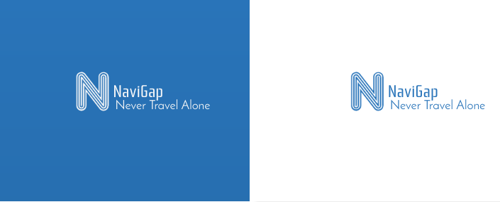
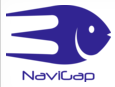
Displayed below are the two final logos that were agreed upon.

Design 1: NaviGap name with Fish logo.

Screen Shot 2017-04-27 at 10.32.10

Design 2: NaviGap name with slogan in blue / white.
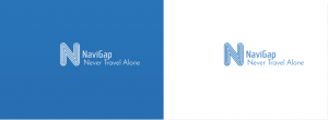
Screen Shot 2017-04-27 at 10.38.02


Conclusion:

JAMR considered the two final logos and agreed that design 2 was the most fit for purpose since it it was clear what the functionality of the app was from the slogan tag line and the ‘N’ initial of NaviGap made a good icon that would be recognisable on smart phone / tablet buttons and in the app store.


Recent Posts

  • Privacy or the lack of it?!
  • Graph Theory applied to the Social Network
  • How Might We Build User Trust?
  • NaviGap Logos
  • How social media has changed the way we travel.

Recent Comments

    Meta

    • Log in
    • Entries feed
    • Comments feed
    • WordPress.org

    Posts Calendar

    May 2025
    M T W T F S S
     1234
    567891011
    12131415161718
    19202122232425
    262728293031  
    « May    

    Spam Blocked

    2,106 spam blocked by Akismet

    RSS Active Adventures Blog

    Tagging

    agile analysis angularjs app brief cost data design Development Diagram django experience Graph inspiration interface law legal logo market Metrics mockups money mvc Networks policy privacy profit protection prototype purchase research scrum student surveillance survey surveys travel Trust UI UML user
    Proudly powered by WordPress | Theme: Motif by WordPress.com.