
Hello everyone, this post is about some updates to our Neighbourhood interface. We now have the Reward Points pages and complementary My Account page according to Mariam’s post.
As Mariam posted yesterday, we introduced Reward Points as the result of our discussion, so we need to have relevant pages to for their use. The functionalities needed for these pages are: Selecting Location, Using Reward Points and Transactions History.
Firstl, we need to change the tab bar from four buttons to five buttons to add the Reward Point section (Fig. 1).

Fig. 1
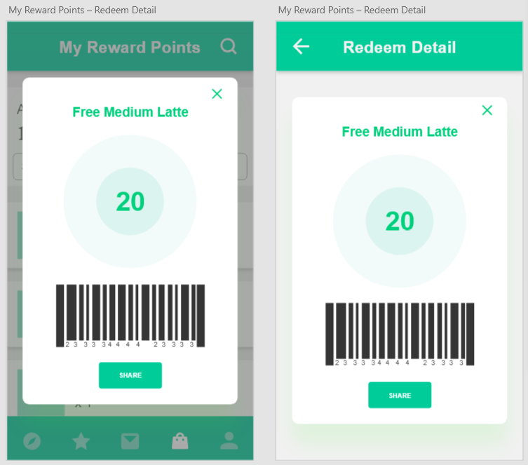
And now we have pages (Fig. 2).
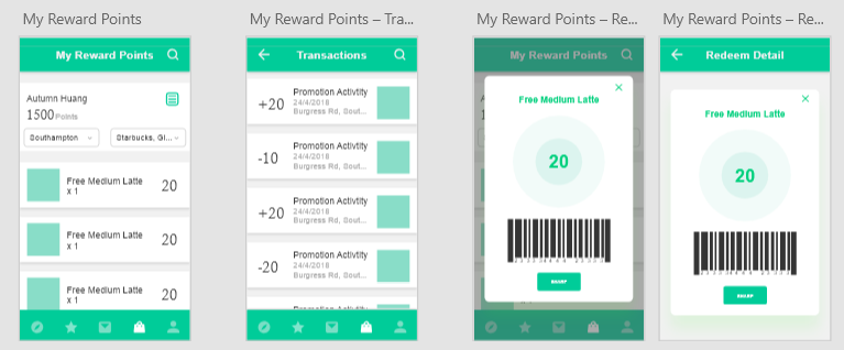
Fig. 2
The first page shows the balance that a user has. The two drop-down menus allow users to select different locations, shops and restaurants etc.. The discounts according to the establishment selected are placed below, showing the type of redemption.
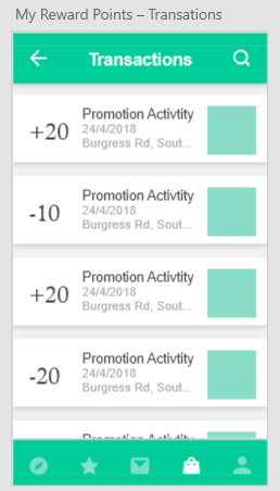
The second page (the second page from the left in Fig. 2 ) is the Reward Points transaction history, showing all transactions with the amount, time and location by clicking the document icon on the top right of the page. Shivam suggested that users can directly click a number so that it would to more clean and short to show the history page, but I decreased the font size of the number, which makes it difficult to click, therefore I also added an icon to enable easy user navigation to the history page.
If the user clicks a discount card, the detail page with a barcode will pop over the page (The third page on the right in Fig. 2.) ready to be scanned. Once a deal completed, the user’s total Reward Points will change, as per the transactions. The flow of a transaction was introduced in Mariam’s post. There are two styles of details page, one blurs the background and the detail page on the first page, another one is opening the new page to show it.
Here I encountered an issue about how a user’s Reward Points balance shows. At first, I made a the font size for the balance very large. However, this leads to a big blank space on both sides of the number (Fig. 3) and also I was considering whether the amount of the balance should be emphasised by a big font size or not. With reference to some economics apps, I decided to use a smaller font size, because the key function is not showing the balance on this page.
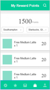
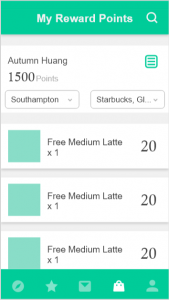
Fig. 3.
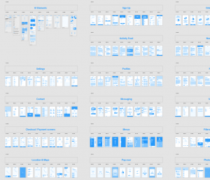
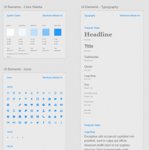
I used a wireframe template designed by the Adobe XD team, as a basis for the visual style deployed here, using some of its icons and elements: