
2012 Social Networks Data Reveals Decline of Many
August 1, 2012
by Tom Brughmans
 Since 2008 ignitesocialmedia.com has been collecting stats on a very wide range of online social networks. Now for the fifth time they published their annual report, making available a wealth of valuable data. The 2012 report reveals that the Online Social Networks market seems to become increasingly saturated, with a few giants dominating the market whilst the vast majority sees a decrease in interest. Work by Soton DH members in the SMiLE project (Social Media for suppporting Live Events) throws a different light on this ‘saturation’ by exploring how a combination of networks can be sensibly used on-the-spot, live. Does this report suggest that such an approach is doomed to fail? Not really. Although a small number of networks might dominate the field, these could form the glue or hubs in an integrated approach drawing on the specific functionality of a multiplicity of networks.
Here is what Brian Chappell of ignitesocialmedia.com has to say about the report:
2011 marked the second year in which many social networks started to wain as social network saturation kicked in. The questions remains, how many social networks can you actively stay up to date on? As Facebook became the mainstay for many users in late 2009 and into 2010 and continuing into 2011, we see the continued fallout in interest for many other social networks. There are still a few social networks that are growing, year over year, however, such as Tumblr, Reddit and Twitter, to name a few.
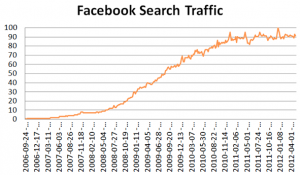
And here is the methodology they used to collect the data:
Reporting is the same as last year – most sites’ search stats were pulled back by querying just their name. For example: “Twitter”, instead of “Twitter.com” However, with that said, certain networks such as Tribe.net still needed to utilize the name.com variation, since people looking for tribe could be looking for a myriad of things, thus corrupting the data set.
All data continues to come from Google because they have one of the largest data sets on the web. We continued to use their Google Ad Planner and Google Insight for Search products to pull demographic and geographic data.
The Top Cities and Top Region reports show proportionate interest levels to the area based on the given search query.
The Demographic and Geographic reports have Y axis numbers that are percentages out of 100, therefore if the score is .52 then it is 52% of the population.
The Search Traffic reports are based on proportionate search traffic for the given query. It is on a scale of 100. Therefore if a given month shows the chart near 100, then that is the busiest month for query searches ever reported in Google during that given time frame.
Categories: Uncategorized. Tags: #SMiLE, Blog, facebook, ignite, network analysis, social media, social network analysis, and social networks.