
Following work by POPS member Maria Petriti, these initial mock-ups have been revised to conform with our chosen colour scheme. Our colour scheme is loosely based around our chosen background image, shared between both the app and our desktop blog, as we feel this image encapsulates the aim of the app as being a tool for bringing people together. As such, our colour scheme is loosely based around prominent colours from this image: teal and gold. The image was carefully chosen not only for its portrayal of a diverse group of people using an app – which is reflective of our user base – but also due to its status as a royalty free image, thus avoiding issues related to copyright. Our use of a familiar image and colour scheme is a way to align ourselves with a familiar style, and as such, a form of branding. This forms part of the app’s identity which is important for future business and marketing.
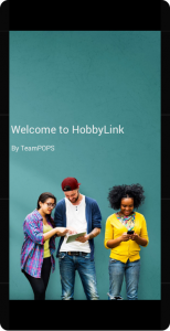
As described above, it was decided to use our header image between our app and blog to create a form of branding and colour scheme association with our app. The splash screen runs for several seconds before automatically transferring the user to the login page.
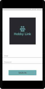
A user will be presented with a login screen in which they will use their university credentials to log in. As yet, our app logo is undecided.
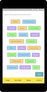
Upon registration, users will be presented with a number of pre-determined interests based on popular choices from other users, as a means of “jump starting” their profile. Similar techniques are used by sites such as Tumblr, which gives new users a list of interests which they can “follow”. Our list view here is inspired by this, and in using a familiar technique which users may have used before, it provides a more intuitive experience for users.
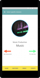
Our hobby swipe page is inspired by the popular design technique “swiping”, which was popularised by apps such as Tinder. Like the above interests list page, the inclusion of this design gives users an already familiar and novel way to select interests. Interaction works via a single interest appearing on the page, both with a description and photo, which users would then swipe left for “not interested” or right for “I’m into this”. This is a quick-fire, novel means of users discovering interests they can be matched to, and in using randomised interests, people may discover options they may not have initially thought of, or had not realised the app could help them find friends for. This adds a fun, easy to use element of implementation for the app to to the use of intuitive, well known gesture elements and low commitment interaction with just one finger.
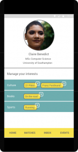
A user’s homepage will list more specific interests grouped by a larger field of interest. Additionally, the home page will display the user’s details and profile picture.
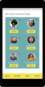
The matches page will show the user friend matches based on mutual interests. Profiles are available to view before the user needs to commit to adding someone as a friend. Users can also remove potential matches from this page using the “X” button.
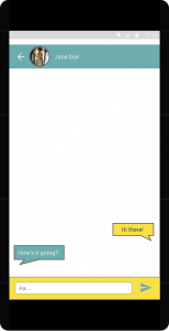
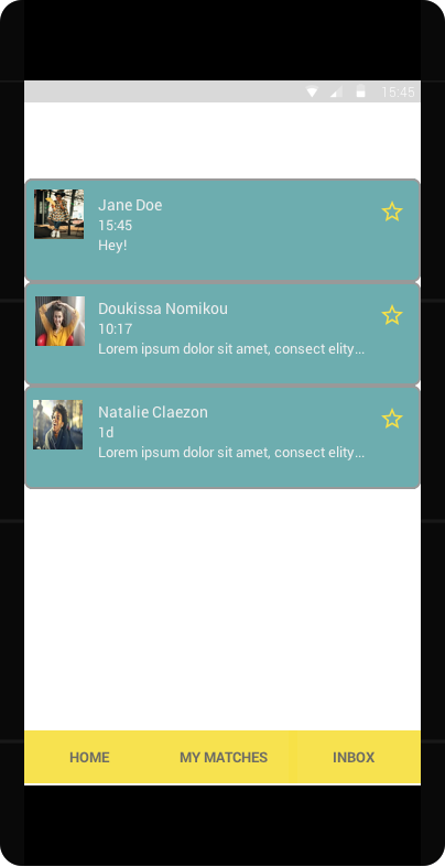
The chat page allows the user to message added friends to discuss interests and meetups.
Overall, we have adhered to popular and intuitive mobile application design as set out in both in mobile design best practices from platforms such as Android and iOS, as well as guide literature in this area. Additionally, we have attempted to include popular and trending application aspects with a conscious understanding that mobile application design is not analogous to WIMP based systems due to the differing methods of interaction.
Neil, T. and Tidwell, J. 2014. Mobile design pattern gallery: UI patterns for smartphone apps. Second edition. Cambridge: O’Reilly.