4.2 Choropleth mapping
Choropleth mapping involves shading a group of regions according to a given attribute, classified in an appropriate manner. In health applications of GIS, choropleth maps remain one of the most common methods of displaying data and so it is crucial to understand the issues involved in producing such maps for disease data.
A choropleth map : ‘A map that shows numerical data for a group of regions by (i) classifying the data into classes and (ii) shading each class on the map’
(Clarke, 1999)
In health applications of GIS, many choropleth maps involve rates, in which the number of individuals suffering from a particular cause of morbidity or mortality is divided by the total population at risk. Frequently, these rates may be standardised to take account of differences in population structure. Although choropleth mapping is primary used with areal data, in some situations it may also be used with point data. For example, in a developing country setting, disease prevalence as recorded at health centres may be mapped using choropleths by first producing Thiessen polygons.
Choropleth maps are popular in health GIS applications for a variety of reasons. One reason is that map users often have responsibility for a geographically defined area, such as a Primary Care Trust (PCT) in the UK . If health professionals can readily identify PCT boundaries on a map and read off the relevant disease statistic, then this immediately relates to their area of responsibility. Choropleth maps also prevent disclosure of confidential information about the disease status of particular individuals and they are relatively straightforward to produce from existing data using standard GIS software.
An important initial step in producing a choropleth map is to decide upon appropriate geographic units for the display. In ideal circumstances, the geographic units chosen should be broadly homogenous in terms of disease risk factors, have similar populations and areas, be relevant to potential map users, have sufficient resolution to discern patterns, and have constant boundaries over time. In practice, no one set of boundaries can meet all of these criteria simultaneously and so the geographic units used in a choropleth map will necessary involve some compromise. Health-related geographic units, such as PCTs in the UK, remain a popular choice in choropleth maps of disease.
Another important step in designing a choropleth map is to classify disease or mortality rates into ranges of values that can then be shaded in an appropriate colour. Many methods exist to classify disease rates for a choropleth map and a full description of these methods is beyond the scope of this object. However, in a health context, research using mortality maps (Brewer and Pickle, 2002) suggests that the use of quantiles produces maps that are easily interpreted by a general readership. The quantile method involves using colours in such a way that an equal number of geographic units falls into each colour class. Thus, for a quantile-based map of heart disease rates in 100 PCTs, the 20 PCTs with the lowest heart disease rates might be shaded in light brown, the 20 PCTs with the next lowest disease rates in a darker brown, and so on with the darkest brown being used to display the 20 PCTs with the highest heart disease rates.
The selection of appropriate colours to display health-related choropleth maps is also important. In addition to general cartographic principles governing use of colour, there are specific circumstances where particular use of colour with health data is justified. Standardised Morbidity or Mortality Rates (SMRs) express actual morbidity levels relative to the rate expected from an area’s population structure. Typically, SMRs greater than 100 signify higher than expected morbidity or mortality, whilst SMRs less than 100 signify morbidity or mortality that is lower than expected. For a map depicting SMRs, the reference number 100 is therefore an appropriate inflection point to depict with a marked change of colour. Thus, SMRs less than 100 may be drawn in shades of one colour (e.g. green) and SMRs greater than 100 in shades of a second colour (e.g. pink). Such a colour scheme is known as a bipolar colour progression (see below) and examples of this may be found in the US Atlas of Cancer Mortality.

Although choropleth maps are very widely used, it should be borne in mind that they have their limitations. Some of these limitations are shown in the diagram below. For example, the sharp changes in disease rates at the boundary between different districts are seldom real and are often an artefact of the geographic units used. The uniform shading of a given polygon may similarly mask variation in disease rates within a given boundary. The viewer’s eye is often unduly influenced by large regions and yet frequently these regions are rural and sparsely populated. Finally, it should be borne in mind that the areal units used can greatly influence the patterns observed – a choropleth map based on census tracts may thus give a very different pattern of disease rates compared to a map based on catchments of doctors’ surgeries.
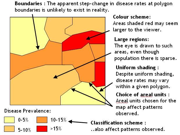
Limitations of choropleth maps
Activity
Read the references below, then download the instructions (both ArcGIS Desktop and Pro format) and data in the zip file that describe cancer mortality for US counties, from 1970-1994.
Before doing so, you may wish to refresh your knowledge of cartographic display techniques within ArcGIS. If you do wish to refresh your knowledge of this area, head for the website that accompanies the course textbook by Cromley and McLafferty at http://www.guilford.com/p/cromley/ and follow the link to the ‘companion web page’. On this page, download ‘exercise 5: mapping health information’. Note that the practical instructions are in the subfolder ‘pdfs’ and that the ArcGIS version 10 instructions are in the file whose name ends ‘v10’. Note also that the various map layers for the exercise are in the ‘data’ subfolder.
References (Essential reading for this learning object indicated by *)
- The ColorBrewer web site, produced by cartographer Cindy Brewer, provides a very nice resource for developing choropleth maps:
* Pickle, L. W., Mungiole, M., Jones, G. K., and White, A. A. (1996) Atlas of United States Mortality. National Center for Health Statistics, Maryland USA. Available on-line at: http://www.cdc.gov/nchs/products/other/atlas/atlas.htm
Although you do not need to read it in order to complete the activity, this article describes research into classification methods for choropleth maps of health data:
Brewer, C. A., and Pickle, L. (2002) Evaluation of Methods for Classifying Epidemiological Data on Choropleth Maps in Series. Annals of the Association of American Geographers 92, 662-681. The content of this article is also available here: http://test.scripts.psu.edu/faculty/c/a/cab38/Brewer_Annals.pdf
Further guidance on choropleth map production for rates is available through this article:
Richards, T. et al (2010) Choropleth Map Design for Cancer Incidence, Part 1. Preventing Chronic Disease 7(1): A23 https://www.ncbi.nlm.nih.gov/pmc/articles/PMC2811518/ .
The data that form the basis of the practical are taken from this site: https://datascience.cancer.gov/resources/nci-data-catalog
Clarke, K. C. (2000) Getting Started with Geographic Information Systems. 3rd Edition. Prentice Hall, New Jersey.