GBO Title Sequence

When deciding I wanted to do a title sequence, I decided to start by looking at current TV shows that are currently popular amongst families, and think about what I would change with them. I immediately thought of Great British Bake off. I had always found the title sequence quite boring.. it displays beautifully arranged baked goods.. but isn’t very exciting. I knew it was something that could be worked on and changed. The credits are all at the end instead and are shown very quickly. I think one thing I would change, is to include the credits at the start and think of a way to creatively include them.

Combining illustration and film

My pathway is Illustration, so I wanted to find something that was a combination of illustration and film. The video shows black and white footage, with colourful animated doodles over the top. The doodles themselves are quite simple, but are successful. The bright colours work well against the black and white film and really jump out at you. The same technique could be recreated with animating in Premiere pro.

Napoleon Dynamite Title Sequence

Napoleon Dynamite is known for it’s experimental and creative title sequence. I love how something that’s been made quite amateurish.. is so effective and successful. I would love to create something that has a similar feel when it comes to actually filming my title sequence. I like how the food is almost.. disgusting, like cafeteria food. You can clearly tell that the story will open in a high school with teenagers. The opening title sequence was filmed by Jared Hess in his basement last minute. Originally there wasn’t an opening sequence at the start of the film at the Premier, and after lots of people questioning it they decided to make one.

Moonrise Kingdom title sequence

Wes Anderson is exceptionally well known for his quirky, atmospheric films with their elaborate score (usually composed by Alexandre Desplat), cozy editing, odd story-lines, and general understanding of capturing the time period the film is set in. The entire film’s aesthetic can be conveyed through a title sequence alone, as displayed in his 2012 piece Moonrise Kingdom. Everything here pulls the sequence together from the choice of font to Benjamin Britten’s classical piece to the costumes to the editing. But it is almost odd, as Benjamin Britten’s piece “The Young Person’s Guide to the Orchestra, Op. 34” is powerful and almost menacing, and the opening scene is very mundane. We see an average house, average games being played, average chores being completed, but a constant: a girl – Suzy – looking out of the average house with binoculars. It is left unclear, purposefully, what exactly she is looking for, as it ensures the audience wants to keep watching.

I personally love how silent the film starts, with only a distant, muffled sound of rain and then a few footsteps. It’s something I want to do for my own film, start with silence and then have some sound and then cue music and a voiceover. Anderson knows that a story needs style to complete it, which is how he accomplishes such atmospheric works. Moonrise Kingdom in particular inspires me, not because I am trying to create something from a different time period or a time sequence, but because it shows me all the aspects I must consider when constructing my own film. I want to choose the right music to convey a tone, I want to have the right voice to set a feeling, I want to edit the colors to match the product and message, the words to make sense. It all must come together cohesively. As Anderson proves, words can be useful but aren’t necessary to get attention.

Girl Gang | PrettyLittleThing

Pretty Little Thing is one of my all time favourite brands selling products from body con dresses to denim jackets. The important elements of this brand are that they keep up to date with the latest fashion trends and celebrity styles with affordable prices. For my film project the mood and theme I am aiming for is casual and party wear for A/W 2018, as they are wearing jeans, jackets, trousers etc., along with smarter light clothing for the evening in my footage . Hopefully my two models create the mood of sassy and confident young women in their outfits from PLT. The main focuses in my video are the product and the models.

To get the customers to keep buying from their brand they always have an offer, for example £1.00 next day delivery or 20% off. They also have a #PLTSTYLE hashtag on Instagram encouraging customers to photograph their outfits and post them on social media. PLT also have celebrity endorsements for their brand which makes the target consumers notice the brand, recently they have had Kim K collaborating with them promoting a range of party wear.

Digital Error/Glitches

Digital Error/Glitches

I recently went on a shoot without planning anything before hand and just wanted to see where it would take me. I ended up disliking the footage and was unsure what my intentions were going to be when it came to editing it into a film. When I was flicking through the videos I came across a glitch in one of them, which was due to the chip in my SD card falling out. These corrupted files reminded me of previous films I have made where I would create the glitches on purpose to represent a flashback as my films were based on nostalgia. This has led me to the idea of experimenting with ‘glitches’ and digital error, and what they look like frame by frame – the composition of the images, lines, colours, etc within them. I’m hoping to base my film for this module on nostalgia/glitches again, but focus on the editing side of it. I will be experimenting with the editing software to see how I can distort my footage and create a ‘distant memory’ sort of feel.

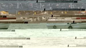
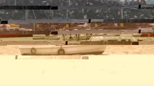
1 Screenshots of the glitch in my video. (I wanted to see what it looked like frame by frame  


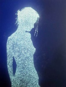
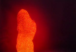
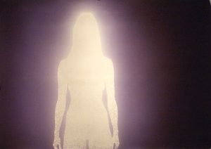
Maria Niro’s ‘Glitch Telemetry’

Link to short film:

http://mnphotovideo.weebly.com/glitch-telemetry.html

Niro uses a negative effect in her film which instantly distorts the images and makes the setting unclear. Her use of space on the screen is interesting. The first clip moves into different positions on the screen with a flickering strobe effect, which then duplicates into three different screens, allowing you to watch three shots at once. A lot of the shots are abstract – you’re able to distinguish what the object or figure is, but it might be a close up or section of it. The negative effect helps to distort the objects as the blocks of monochrome colours create a sort of silhouette effect, as it merges everything together. The background noise plays a huge part on the atmosphere of the film, as the sounds are eerie and distorted. When we first listen to it, it feels like we aren’t familiar with the music, but if you break down the different sounds, we notice that they are similar to things that we hear in everyday life, like tapping, clicking, creaking, etc. Whether it’s laughter, dialect, specific words that are picked up, music playing, etc. each memory tends to have a sound that comes with it and sometimes there are noises that are more significant to the memory than others. This has inspired me to consider the different sounds that come with a memory and try to create an audio piece for my film that will help set the scene.

Christopher Bucklow and Hidden Identity.

I went to see Christopher Bucklow’s work in Southampton and fell in love with the coloured images he creates. The identities of the people are hidden however I feel we get an idea of their personality/aura thanks to the colours that surround the silhouettes… This has given me the idea to add colour to my interviews in order for the viewers to differentiate the diverse victims and perhaps get a feel of their personalities but not their faces… red often represents passion or danger, we often associate green with the earth, purple with mystery… I will perhaps look into the different meanings of colours before I make any decisions!