An important aspect to take into account for the success of the social network is branding. This includes the creation of a logo that appeals users whilst transmits the values of the project at a glance.
When creating a logo, we need to think about the target audience. For Britizen our target is the whole population of Britain! This is a wide range of people, which makes it difficult to design specifically for one kind of person and ideology. Going for an abstract design would help users recognize the brand easily, but we should also make sure that it is concrete enough so users directly relate it to a social network that protects the British national values.
Besides, this project will be supported by the British government and also has serious connotations, so the logo should stay somehow serious and friendly at the same time, transmitting a young and lighthearted image that appeals public to use the application.
So, what do all British people have in common? The flag of the country: The Union Jack or Union Flag [1]. This way it was decided that the logo and the site itself should include the colours of the British flag in order to remind instantly of the nation.
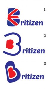
Taking all these things into account, three different logos were proposed:

Logo options for Britizen
Logo 1 transmits instantly and unmistakably the idea of an application related to Britain. On the other hand it is more conservative and obvious, and a bit more complex than the other options.
Logo 2 has a abstract design playing with new shapes for the letter B. While it looks abstract, modern and young, it may be difficult to associate it with the purpose of the social network.
Logo 3 is halfway between Logo 1 and 2. It is not as abstract as Logo 2 and is easy to associate it to the British flag, but it may not be serious and concrete enough.
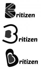
A greyscale test was run in order to analyze how the logos would look in grayscale documents, having the following results:

Greyscale test of the logos
We appreciate that Logos 2 and 3 are less easy to recognize due to the loss of hues.
After these evaluation, it was decided that the option that would fit Britizen the best is Logo 1.
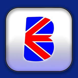
Looking at the development of a future smartphone App, a pilot icon was designed using the chosen logo. Only the “B” will be included over a white background with a slight gradient in order to make it simple and easy to recognize.

Pilot icon for the Britizen App
References
- The Flag Institute. 2017. The Union Jack or The Union Flag? – The Flag Institute. [ONLINE] Available at: https://www.flaginstitute.org/wp/british-flags/the-union-jack-or-the-union-flag/. [Accessed 17 April 2017].

