All posts by travis

Exploring the PageRank Algorithm

INTRODUCTION & BRIEF HISTORY

At the self-proclaimed “heart” of Google’s software (2014) lies their remarkable PageRank algorithm. PageRank added an extra hypertextual layer of abstraction to earlier keyword driven search models used by companies such as AltaVista and Infoseek (Chater & Oaksford, 2008). PageRank utilised a weighted ranking algorithm that took into account the number of hyperlinks pointing towards a connected page and their interrelation with other popular websites (Brin & Page, 1998). Named after its inventor Google founder Larry Page (not just a simple reference to the “pages” being ranked) (Page, 2001) PageRank was based upon previous conceptual ideas of academic citation using hypertext technology. These original principles were pioneered through the earlier works of Ellen Spertus (1997) and Massimo Marchiori (1997). These early concepts around hypertext and academic citation where then modified and applied directly to ranking webpages popularity and their relevance to web user’s search queries.

ALGORITHM BREAKDOWN

The PageRank Algorithm uses a probabilistic distribution to calculate the rank of a website. This rank is then updated every time Google’s web-crawler scours the web. This follows the Random Surfer Model which models user behaviour based on the probability that they will follow a hyperlink to a new site or randomly leave and request a new page.

There have been two public versions of the PageRank algorithm released which were famously mixed up by the Google founder Serge Brin and Larry Page in their original paper The Anatomy of a Large-Scale Hypertextual Web Search Engine (1998). 

Figure 1. PageRank without the damping factor being relative to the number of pages

PR(A) = (1-d) + d (PR(W1)/C(W1) + … + PR(Wn)/C(Wn))

Figure 2. PageRank with the damping factor relative to the number of pages

PR(A) = (1-d) / N + d (PR(T1)/C(T1) + … + PR(Tn)/C(Tn))

ALGORITHM KEY FOR FIGURE 1: from http://interestingwebs.blogspot.co.uk/2009/05/simple-explain-of-google-pagerank.html

PR(A) – Page Rank of page A
PR(Wi) – Page Rank of pages Wi which link to page A
C(Wi) – number of outbound links on page Wi
d – damping factor which can be set between 0 and 1.

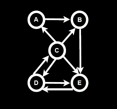
PageRank is calculated as a recursive function, meaning the accuracy of a page’s ranks increases after every iteration. If we look at the following diagram below in figure 3.

Figure 3. PageRank Diagram: from http://codispatch.blogspot.com/2015/12/java-program-implement-google-page-rank-algorithm.html
Simple PageRank Algorithm

We can see the probabilistic distribution using eigenvector centrality. For example on the first or ‘zero’ iteration the PageRank value is calculated as an even distribution of 1 divided by N number of pages. Which would give a value of 0.2 for each of the 5 pages (1/n). As you can see in table 1 below.

Table 1: PageRank Values: from http://codispatch.blogspot.com/2015/12/java-program-implement-google-page-rank-algorithm.html
PageRank ValuesOnce the initial zero iteration value has been calculated as seen in figure 4 above in the 0 row. The next iteration will then divide each page or node’s current rank by the number of outbound links. For example node C has 4 outgoing links so its initial value of 0.2 is divided by 4 to give a value of 0.05. As node A has 1 inbound link from node C it now has a value of 0.05. This process is repeated for all of the inbound and outbound links for each node and repeated for each iteration as show in the table in table 1.

After this initial calculation has been made a dampening factor taking into account the probability of a user leaving the site is incurred. Note – Google employees have alluded to the fact that the dampening factor of the random surfer model lies somewhere between 0.7 and 0.85 (Levy, 2011).

POTENTIAL INTEGRATION INTO BRITIZEN

The concept of if eigenvector centrality utilised by Google’s PageRank algorithm can be applied successfully to the Britizen’s scoring system If the dampening factor induced by the random surfer model of the PageRank algorithm is discarded due to its irrelevance in peer to peer scoring. This is due to the fact that the hypertextual links are not hypothetically traversed as in Google’s model and are therefore superfluous in our design.  Utilising the dispersal of scores via eigenvector centrality based on the peer to peer links on the site where a user’s number of friends represents even bidirectional links could induce certain desirable social behaviours. For example if a user had a small closely-nit group of friends with high Britizen points this would be more beneficial than having lots of friends with mediocre scores as the division of the users overall score would be dispersed equally to their peers. The implementation would of course only utilise eigenvector centrality as a weighted proportion or metric to calculate the user’s overall score, depending on how much social engineering is the focus of the scoring system. For more radical effects I believe a weighting of 50% of a user’s overall score would statistically show the greatest results as the user’s own background and whom they befriend would be calculated in equal measure, allowing us to observe the social effects of our scoring algorithm more clearly.

REFERENCES

Brin, S. & Page, L., 1998. The Anatomy of a Large-Scale Hypertextual Web Search Engine. Seventh International World-Wide Web Conference (WWW 1998), 14-18 April.

Chater, N. & Oaksford, M., 2008. The Probabilistic Mind: Prospects for Bayesian Cognitive Science. New York: Oxford University Press, USA.

Chitpady , S., 2017. Java Program to Implement Simple PageRank Algorithm. [Online]
Available at: http://codispatch.blogspot.com/2015/12/java-program-implement-google-page-rank-algorithm.html
[Accessed 23 April 2017].

Google, 2014. Our history in depth. [Online]
Available at: https://www.google.com/about/company/history
[Accessed 16 11 2016].

Levy, S., 2011. In The Plex: How Google Thinks, Works, and Shapes Our Lives. New York: Simon & Schuster.

Marchiori, M., 1997. The Quest for Correct Information on the Web: Hyper Search Engines. The Sixth International WWW Conference (WWW 97), 7-11 April.

Page, L., 2001. Method for Node Ranking in a Linked Database. USA, Patent No. US 6285999 B1.

Spertus, E., 1997. ParaSite: Mining Structural Information on the Web. The Sixth International WWW Conference (WWW 97), 7-11 April.

Webs, I., 2009. Simple Explanation of Google PageRank. [Online] Available at: http://interestingwebs.blogspot.co.uk/2009/05/simple-explain-of-google-pagerank.html




Facebook Integration

Introduction

This blog will demonstrate and explore Facebook integration into our online Britizen platform. I will first discuss the functionality offered by Facebook integration, followed by a discussion of the initial setup process and requirements, and finally some in depth examples of our implementation’s design.

Functionality

According leading online marketing firm Jetscram (2015) most online users in the UK are already signed up to Facebook. Facebook integration has become a common constituent of the development process for modern web and mobile applications. It allows users an easy way to authenticate their login credentials without the developer having to create a bespoke login system. This also allows developers to add social characteristics and metrics to their application in form of personal profiling and analytics.

Setup & Requirements 

This will not be a step-by-step guide of every stage necessary to implement the Facebook SDK but this will serve as an overview and outline of the most important stages and features.  For this example I will use the mobile iOS platform to demonstrate what is required to integrate Facebook into a potential app. The setup process is essentially split between two main stages: firstly, set up and configure your new app by registering it via the Facebook developer page and secondly, download and add the Facebook SDK to your iOS app build. These two stages will then bridge the gap between your app and the online features of Facebook.

Facebook Registration and Setup

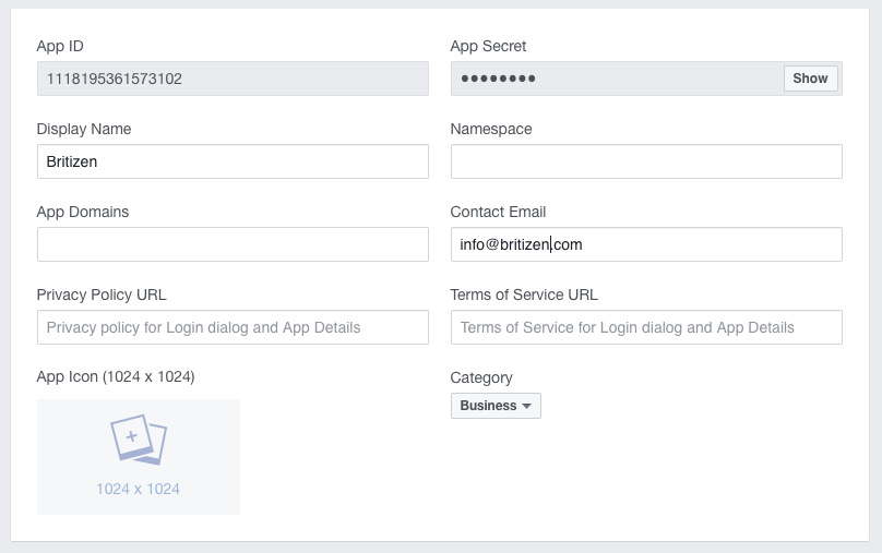
First, sign up to Facebook. This will then give you access to the Facebook developer page which contains relevant downloads for the SDK (System Development Kit) as well as a reference for their proprietary API (Application Programming Interface). To create a new app choose a display name as seen in figure 1, you can also optionally create a unique namespace identifier, this is most commonly created using the reverse namespace convention for example co.uk.britizen.britizen. you can  see an example of the reverse namespace convention later in the IOS configuration screen (figure 3)

Figure1.  App Secret and App Name Selection
Screen Shot 2017-04-08 at 19.43.18

Once you have chosen your app name an App ID and App Secret are generated, you can later use these credentials to connect to the Facebook API from within your application. The App ID and App Secret are used to identify your developer account and allow Facebook to manage and track a multitude of different applications as well as perform app specific analytics. This is contrary to open API’s such as older versions of Google APIs that allowed users direct access to Google API calls without a need for user specific app credentials, by simply editing URI strings.

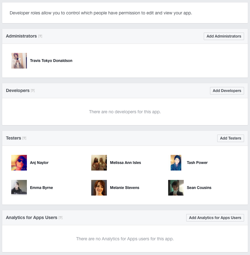
One of the most salient features of the Facebook dashboard is the ability to recruit and delegate other Facebook members from within the role tab in the Facebook developer dashboard as shown below in figure 2 .

Figure 2. Facebook Roles
Screen Shot 2017-04-09 at 20.05.51

The roles of your development team can be ascribed easily which is helpful for delegating tasks to team members. The roles tab also includes deeper levels of functionality such as in depth analytics for users, testers and developers. This can allow you to keep tabs on your development team’s progress from a central integrated hub. This is great for sandboxing early development before your apps go live, so you can work out any issues before releasing your final version to the public. As administrator your Facebook account is automatically verified for testing. The first feature of the Facebook API we will discuss is single sign on.

Single Sign On

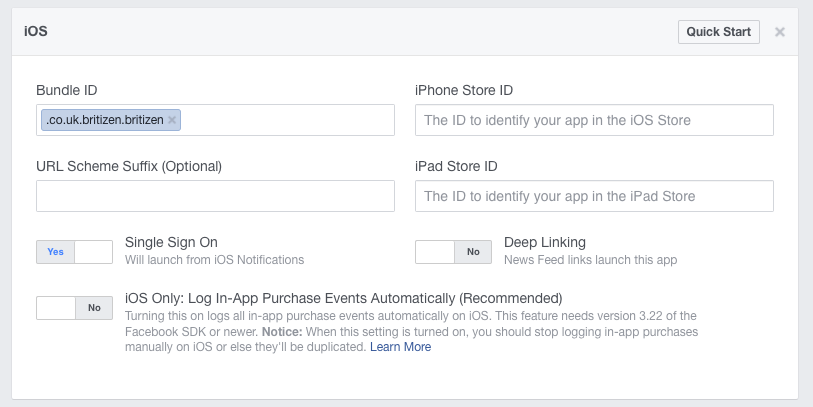
To configure single sign on functionality select iOS tab or which ever proprietary system you are using from the Facebook developers dashboard. Here you can enter the bundle ID for your app, which depending on the nature and platform of your app can consist of either JSON file of meta data if it’s a web application or in the case of iOS an info.plist file which can be edited either in Xcode or a text editor. Make sure that your app’s bundle ID matches the one entered in the Facebook dashboard (you can use the reverse namespace convention for both as discussed earlier in the Facebook registration and setup section). Now select single sign on as seen in figure 3, this allows a user who is already logged in with Facebook to sign into you application with one click. This will generate a unique identifier token which is stored on the user’s device (similarly to how a web cookie stores user information over a period of time) for a user which can be used to login to Facebook as a means of verification. This token can then be used to authorise users for your app. This token can last typically from 24 hours to a 28 days in duration before a user has to re-login to Facebook,  making the sign in process relatively painless in comparison to signing in every time they use your application. The single sign in also eliminates the need for users to re-enter their credentials if they already have a Facebook account, saving a great deal of time when compared to having to set a completely new account with their name and email etc. You now are all set to try out the API on the web dashboard side now let’s delve at little into the app!

Figure 3. Single Sign On
Screen Shot 2017-04-09 at 21.43.05
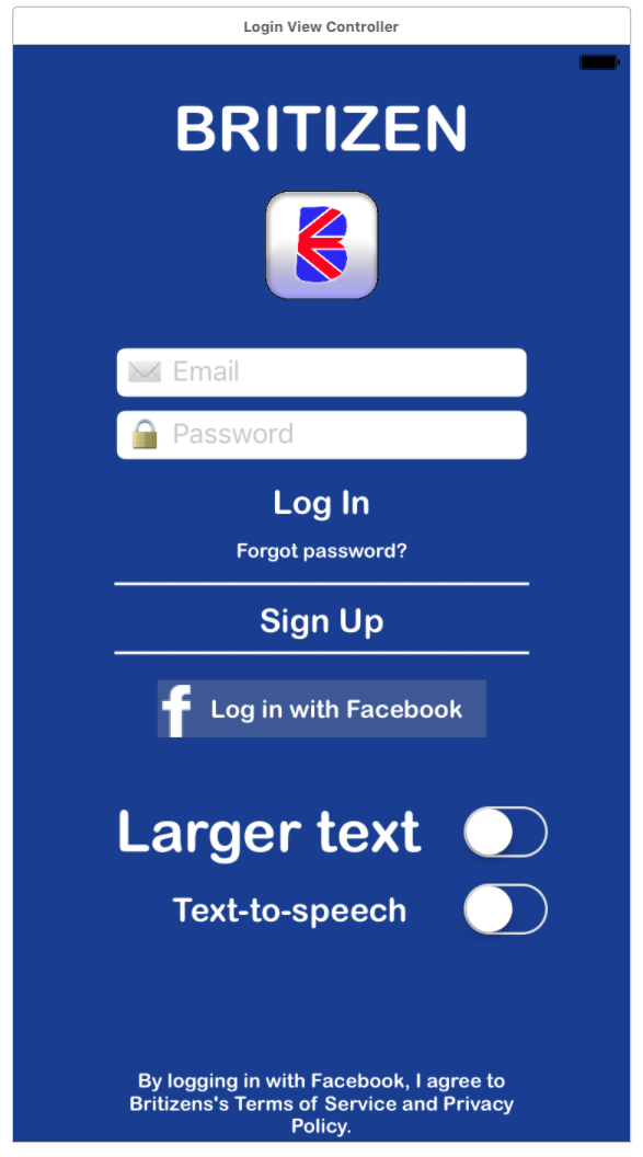
I won’t go into detail about the specific app side coding and installation as it is beyond the scope of this blog post but I will describe the functionality employed on the software side with visual examples of the results. Once you have configured the web side of the Facebook API you must then install the Facebook SDK packages and dependencies into your application following the Facebook API reference guidelines . Please make sure that you whitelist the Facebook API URL, this is a common mistake as most platforms such as Android and IOS will automatically blacklist or block any external servers URLs for security reasons which of course includes any dependencies or APIs you have installed. Once you have correctly installed the Facebook API you can start building your bespoke Facebook single sign on integration. First create a button object called “login with Facebook” as shown in figure 4 below and create an event to fire when the button is touched by the user. Connect this event to the Facebook sign in function designated by the Facebook API reference.

Figure 4. Login Screen
Screen Shot 2017-05-03 at 22.03.25

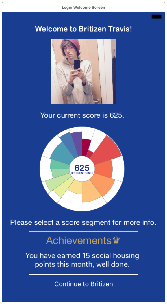
This will connect to the API seamlessly and if the user is already logged in will automatically generate their unique login token and sign them into you application as shown below in figure 5.

Figure 5. Sign in Complete
Screen Shot 2017-05-03 at 22.03.44

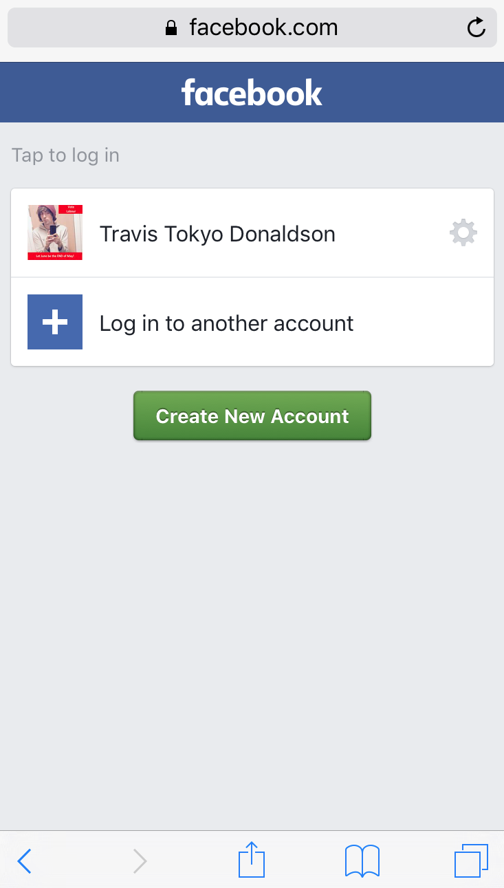
If the user has not signed into to Facebook recently or does not have a Facebook account the API will automatically open a web view as seen in figure 6, that allows the user to enter their credentials. If after the user has connected to the Facebook web view sign in is unable to verify their current account or create a new one, they will simply be returned to the original login screen seen in figure 4. This will fire an a login error which you can choose to ignore or store for your records. If the user is unable to login with Facebook it is considered good design practice to also create your own authorised login system as a back up to make you app more inclusive.

Figure 6. Facebook Login Web View
Screen Shot 2017-05-05 at 12.34.40

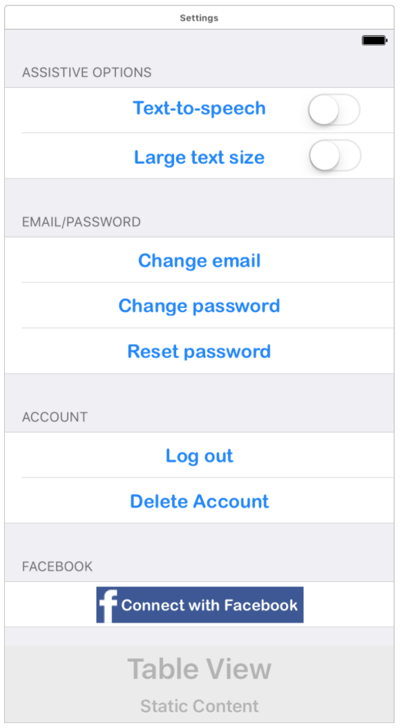
You can also potentially setup similar buttons to connect with Facebook as seen below in figure 7, even after they have logged in with a different system, effectively marrying the two account to each other for one single seamless login experience to a single user account, this is also a powerful feature of the API. You can also of course allow the user to sign out at which point you can direct them back to the original login screen in figure 4 to create a complete login flow.

Figure 7. Settings – Connect with Facebook and Log Out
Screen Shot 2017-05-03 at 22.04.49

I hope this has given the reader some insight into the speed and efficacy of Facebook Single Sign On compared to conventional methods as well as the plethora of features such as analytics and team management offered through the Facebook SDK.

REFERENCES

Facebook, 2017. Facebook for Developers. [Online]
Available at: https://developers.facebook.com/
[Accessed 7 April 2017].

Jetscram, 2014. Social Media User Statistics & Age Demographics for 2014. [Online]
Available at: http://jetscram.com/blog/industry-news/social-media-user-statistics-and-age-demographics-2014/
[Accessed 24 April 2017].


Mobile and Desktop Responsive Design Mockup

This post describes the design process and the final mock up screens for the Britizen mobile application. We decided to focus mainly on the mobile version for the design mockup as smartphones are now the primary method of accessing the web and internet services in the UK, according to industry monitor Ofcom (2015). All images are to scale and were built using Xcode’s interface builder running on iOS 10.3 on a simulated iPhone 7 but are also designed to be responsive for tablet and desktop, as shown in figure 2.

Figure 1. Landing ScreenScreen Shot 2017-05-03 at 22.03.25

The Britizen logo designed by Luis Cayola in his post was utilised throughout the app including the dark blue background colour which is used for consistency and to facilitate a more pervasive brand recognition. The landing page follows a minimalist design of all the salient features needed  for a new user to either sign in using Facebook (see Facebook Integration post) or link to a new account creation page (figure 3). Following from Sue Breeze’s post centred around digital inclusion  the app also incorporates features for people with sight difficulties. These features are the option for larger text throughout the app which is shown as text being over 16pt by the  Royal National Institute of Blind People (2014). This helps to make our app more inclusive for the elderly and people with impaired vision. To further increase the inclusive scope the app we also opted to support text to speech so that users can navigate using the assistive controls on their system either via a computer keyboard or touch screen keyboard, to navigate the various on screen elements while a text to speech synthesiser will describe each element such as ‘input your email’ or ‘next page button’. These features can also be reconfigured in the settings  screen. This screen also includes the legal terms and conditions and privacy statement links for users to peruse before signing up as per the EU Privacy Directives minimum requirements which states that any app that allows for user account creation that stores sensitive information such as personal details like emails and names must show clear and concise terms and conditions and privacy policies, Lubuenda (2016).

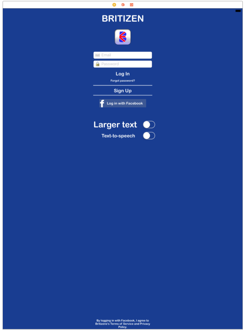
Figure 2. Sign Up Screen – responsive for desktop or large tablets
Screen Shot 2017-05-04 at 13.54.34

This screen shows that in app elements have been designed with the responsive design paradigm in mind. Each element has been given responsive scale and position parameters that will dynamically adapt to the screen size and operating system of the host device.  In this example all of the elements have been scaled to the standard 12pt font size as per the Apple iOS Human Interface Guidelines (2017) for typography and text legibility.  Elements remain centred and visible, relative to the desktop screen width, as well as the terms and conditions text remaining relative to the bottom bounds of the screens as per the original design. These practices are implemented across all of the screen view designs, as scalability is extremely important for a wide reaching inclusive platform such as Britizen.

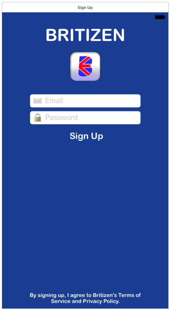
Figure 3. Sign Up Screen
Screen Shot 2017-05-03 at 22.03.33

This is just a simple screen for account creation that allows the user to create their own account based on their personal email address as opposed to simply signing in with Facebook. This again makes the app more inclusive as it is not just targeted on users with Facebook accounts. This is to avoid any bias towards very young and old users who are statistically less likely to have a Facebook account according to leading online market research firm Jetscram’s Social Media User Statistics & Age Demographics for 2014 shown in figure 4.

Figure 4. Social Media User Statistics & Age Demographics for 2014 taken from http://jetscram.com/blog/industry-news/social-media-user-statistics-and-age-demographics-2014/

Facebook Age Demographic Number of Users Percentage of User Base
13-17 9.8 Million 5.4%
18-24 42 Million 23.3%
25-34 44 Million 24.4%
35-54 56 Million 31.1%
55+ 28 Million 15.6%

Figure 5. Welcome Screen
Screen Shot 2017-05-03 at 22.03.44

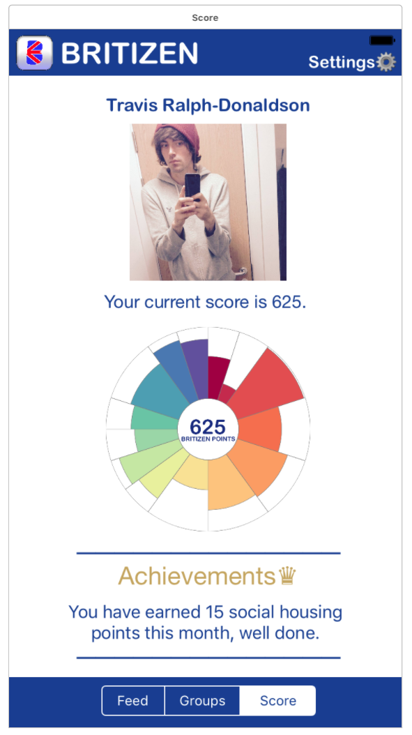
The welcome screen shows a personalised message to the user if they have logged in with Facebook using their display name and Facebook profile picture, this is employed to create a personal bond with the user, as calling people by their first name has been shown to solidify human relationships as outlined by the book Maximum Influence: The 12 Universal Laws of Power Persuasion, increasing the user’s connection and warm feelings towards our app. The user is also presented with their Britizen Score or BP, this score visualisation was built using the D3 visualisation framework which is fantastic for displaying multi-faceted information in segmented views. The user can also look at their recent achievements, this was included to compound the practical usefulness of the platform to the user to increase their motivation to keep using Britizen in the future. The users can then select a link to be forwarded to the main screen which includes a tabulated view of the main”feed”, “groups” and “Score” views.

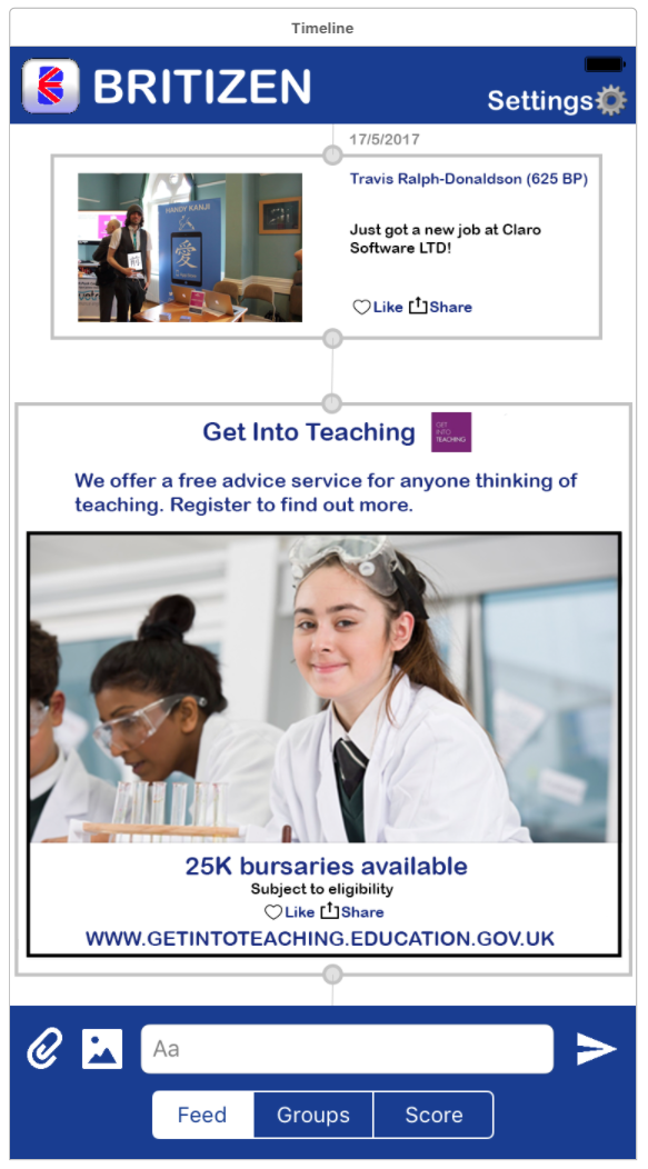
Figure 6. Main Screen – Feed
Screen Shot 2017-05-03 at 22.04.24

This view shows the main layout of the app with the top area of the view delegated to the Britizen logo and and a link to the settings screen. The settings button is configured to be a minimum of 44 x 44 pixels wider as per the Apple iOS Human Interface Guidelines (2017) to account for the user’s finger size when using the touch screen to provide a more responsive interface. The settings and send buttons are also situated on the right edge of the screen to make it easier for the predominantly right-handed users to access. The feed itself is very similar to other social networking sites such as Tumblr, Instagram and Facebook. Providing users with a timeline of posts and events that have taken place on the platform in the form of images and text. This design view also highlights the use of  embedded sponsored advertising in the feed as a potential revenue stream for Britizen’s monetisation as outlined in Sue Breezes post on the Britizen Revenue Model. Users can also  post to the their personalised feed using the controls at bottom of the screen that were modelled on Facebook messenger so users would already have a  good understanding of the universal controls and icons used to post text, images and attachments such as PDFs, for example if they wanted to post their CV.  At the bottom edge of the view, users can navigate the app using the segmented tabulated view control for the “feed”, “groups” and “Score” sections. This type of design is extremely pervasive within apps and should seem simple and intuitive to the user.

Figure 7. Main Screen – Groups
Screen Shot 2017-05-03 at 22.04.32

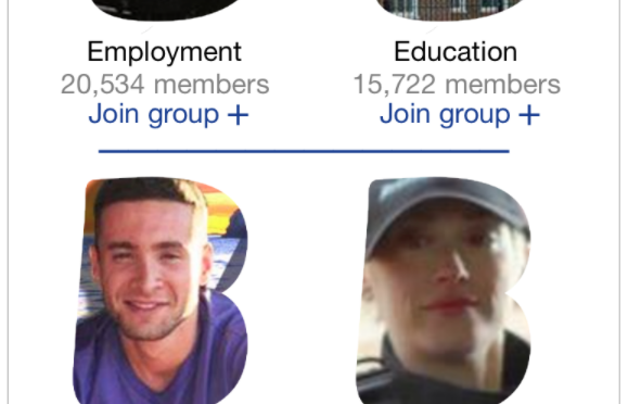
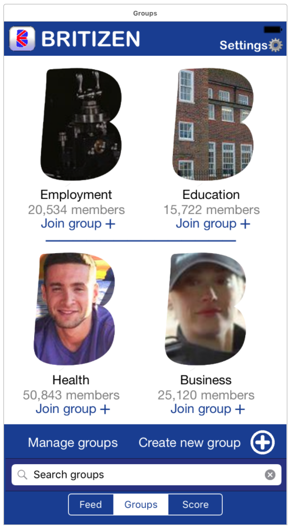
This screen displays some of various groups that are available to join on Britizen. Due to limited real estate of the screen size of iPhone7 and smaller mobile devices when compared to tablets and desktop, this screen example previews  a maximum of 4 groups in any given instance. Each group is designated by a “B” shaped group icon, this icon was created using an image clipping mask in a similar way to how other social networking sites such as Facebook would use a circle mask. The “B” denotes the Britizen’s brand, as one of the initially outlined design focuses, was to keep a consistent British theme and brand recognition. The actual “B” used was taken from Luis Cayola’s Britizen logo design. Users are also presented with the name of each group as well as the number of current members and a button underneath that allows them to join. By selecting the group icon or group name the user will be forwarded to that groups individual page. Users can also explore further Britizen groups as the white area of the view is scrollable.  The ‘Manage groups’ button will direct the user to a group management page where the user can edit their currently joined groups. As well as this the user can also create a new group denoted by the large plus symbol icon which will forward them to a group creation page. Towards the bottom of the screen the user can also perform a textual search for relevant groups that may interest them, which will be updated in the central white scrollable groups area.

Figure 8. Main Screen – Scores
Screen Shot 2017-05-03 at 22.05.35

The tabulated score view is essentially a  user accessible version of the welcome screen (see figure. 5 for more information). The main difference being the colour scheme has been altered to be consistent with the style of the rest of the tabulated views by reversing the blue and white colouring. The only other difference is you are now referred to via your full name in a more serious and formal manner, this is to highlight the scores more official nature of your score when selected within the main screen.

Figure 9. Settings Screen
Screen Shot 2017-05-03 at 22.04.49

The settings screen which is accessible from the main tabulated view screens allows the user to configure their account, email and passwords settings as well as log out of the app. The user can also delete their account which will seamlessly remove any of their data we have stored on our records this is future proofing the app as the UK government is currently considering new laws and sanctions on the storage and control of personal data. This allows the users greater control over the information that is stored about them. The user can also configure the assistive options originally presented on landing screen (figure 1).

REFERENCES

Apple, 2017. Apple iOS Human Interface Guidelines. [Online] Available at: https://developer.apple.com/ios/human-interface-guidelines/visual-design/typography/ [Accessed 24 April 2017].

Iubuenda, 2016. Iubenda Blog. [Online] Available at: http://www.iubenda.com/blog/privacy-policy-for-ios-apps/ [Accessed 24 April 2017].

Jetscram, 2014. Social Media User Statistics & Age Demographics for 2014. [Online]
Available at: http://jetscram.com/blog/industry-news/social-media-user-statistics-and-age-demographics-2014/
[Accessed 24 April 2017].

Mortensen, K., 2013. Maximum Influence: The 12 Universal Laws of Power Persuasion. s.l.:AMACOM.

Ofcom, 2015. Smartphones most Popular way to Browse Internet Ofcom. [Online]
Available at: https://www.theguardian.com/technology/2015/aug/06/smartphones-most-popular-way-to-browse-internet-ofcom
[Accessed 24 April 2017].

People, R. N. I. o. B., 2014. Reading Large Print Size. [Online]
Available at: https://help.rnib.org.uk/help/daily-living/reading/large-print-size
[Accessed 24 April 2017].