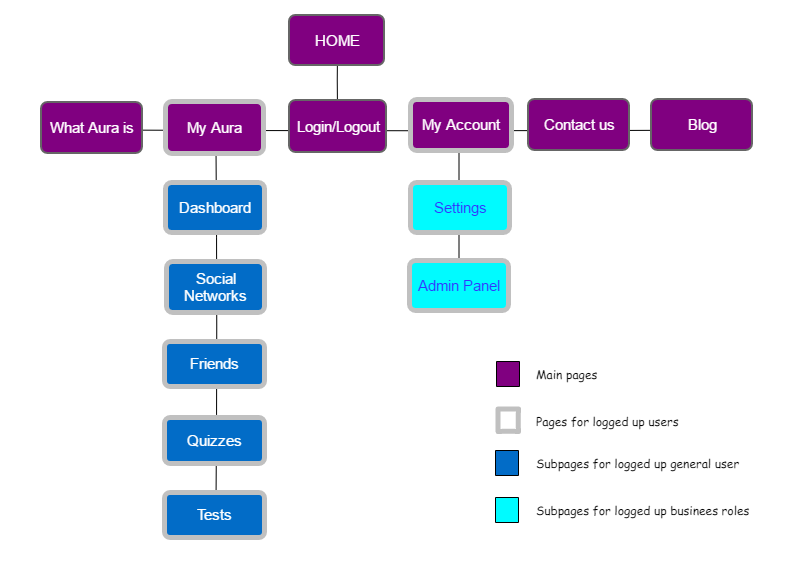
The sitemap of Aura is simple with just a few pages since it is not a social network itself, but a platform that aggregates content from other sources, analyses it and shows some visualizations. Below, you can find the hierarchy of pages that will be found on the application. The main ones are in violet, Aura’s identity colour.

As can be inferred from the legends, two of the main pages (violet) are just shown for logged up users. They are surrounded by a grey border. “My Aura” and its dark-blue subpages are accessed by general users; “My Account” and its light-blue pages are accessed by business roles (recruitment or marketing managers).

Pingback: Mockups – Aura