Building trust in what you see
 
Author: <span>autumn</span>

Design Notes #3

This is the final interface design updates, I added a ‘Comment’ page to show the users’ comments on an activity and add photos replace the blank blocks so that the interface looks more understandable. In addition, I used default Windows 10 screen recorder to record the base interaction on our …
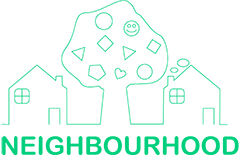
Logo Design

This post will introduce the design ideas of Neighbourhood’s logo, which is the visual representation of our brand values: Trust, Privacy, Having fun, Interests, Exploring. I use CorelDraw as the designing tool for the logo. Deservedly, I choose light green as our logo’s theme colour, keeping the same colour scheme of …

Interface Design Note #2

Hello everyone, this post is about some updates to our Neighbourhood interface. We now have the Reward Points pages and complementary My Account page according to Mariam’s post. As Mariam posted yesterday, we introduced Reward Points as the result of our discussion, so we need to have relevant pages to for …