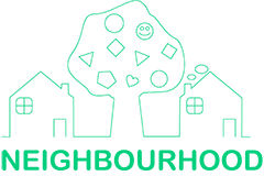

This post will introduce the design ideas of Neighbourhood’s logo, which is the visual representation of our brand values: Trust, Privacy, Having fun, Interests, Exploring. I use CorelDraw as the designing tool for the logo.
Deservedly, I choose light green as our logo’s theme colour, keeping the same colour scheme of our interface. Our logo includes three objects, two houses and a tree with some simple shapes. Two houses mean residents, different families. Go deeper to the meaning, these houses with a door represent the Trust and Privacy. Another object, the tree is the symbol of outdoor and public place. Go further, the tree is a representation of the relationship between neighbours. The shapes on the tree are the abstraction of interests, activities and fun. The outline of these objects is drawn by a continuous curve, which means two houses and a tree are connected. In one sentence, the meaning of logo is that inhabitants are connected by exploring the interests and taking part in activities with others.
![]()
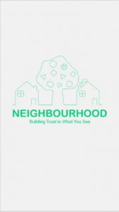
Our application’s icon(Top left of the picture) on the iPhone will be the same tree but have a house on the bottom, showing the meanings accurately and having a good visual experience simultaneously. Also, our launch screen has updated.