
Hello everyone, in this post I will outline the process of application interface design and how I have applied it to the Neigbourhood application.
In the beginning, I will introduce the design tool I am using. In the first section, ‘The Ideas of Design’, I will list the principles of design I have followed. In the second section, ‘Introduction to Each Pages’, I will tell explain the thinking behind the look and feel of each mobile page.
Mobile application – initial layouts
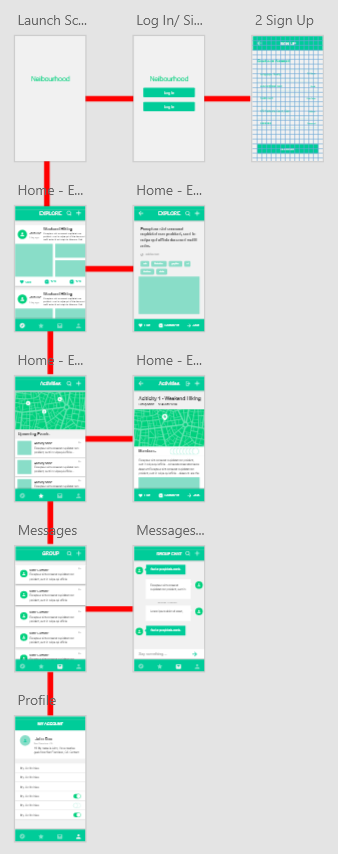
As per our application design process, we now have the initial version of our application layout. The design tool I have used is Adobe XD CC(XD), instead of Coreldraw (as originally intended), because I was unable to access a suitable trial license. Adobe XD CC is a prototype design software that released in January 2018. It has an added design benefit, that it supports the creation of animations showing simple interface interactions.
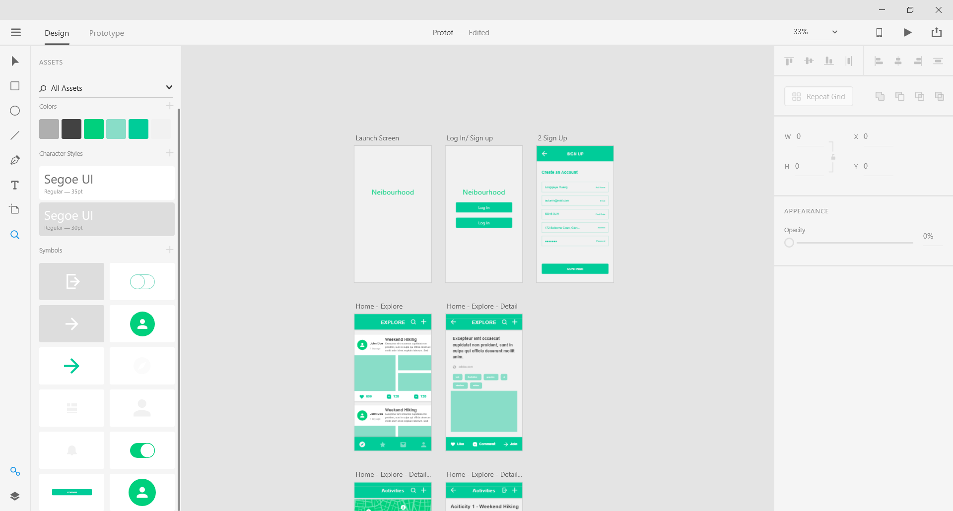
Mobile Application layouts on Adobe XD
Design ideas and thinking
Most of the design thought applied below is referred to in Apple’s Human Interface Guidelines. In this section, I will introduce some of the basic principles that I have followed.
1. General Principles
(1) Provide efficient functionality with unobtrusive appearance.
(2) Use various interface elements provided by the system, standard text styles and uniform terminology. The behaviours of an app should be predictable.
(3) Users should have good interaction with the app. Manipulations, like rotating the phone or using gestures to operate content on the screen, should be immediately responded by appropriate feedback like sounds.
2. App Architecture
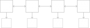
(1) Navigation. IOS have three styles of navigation: Hierarchical Navigation, Flat Navigation and Content-Driven or Experience-Driven Navigation. I will choose Flat Navigation and design a good information structure that makes it as fast and easy to get to content as possible.
Flat Navigation and Flat Tab Bar. From Apple.
(2) Request Permission. If we need information about the user, device or environment, query the system for it as far as possible instead of asking the user to input.
3. Images size and format
(1) Image size should use 3x factor to supply the high-resolution devices (iPhone 6d, 7, 8, X).
(2) Using an 8px-by-8px grid to keep lines sharp and content ‘crisp’. In the initial version of the design, I use 25px-by-25px instead.
25px-by-25px grid
(3) The appropriate format of pictures is png because it is the lossless format, meaning that compression doesn’t lose the details of pictures.
(4) When using jpg images, try to experiment with compression settings on the image to find the optimal value that balances size and quality.
(5) Providing alternative text labels for images and icons to be described by screen readers.
4. App Icon
(1) Simplicity. Use a simple shape to present the purpose of the app. No need to add details because the details can be hard to discern.
(2) Keep background of icon simple and clean.
5. Launch Screen
To enhance the perception of the app as quick to launch and ready for use.
(1) Confirm the elements of launch screen and the first screen of the app.
(2) Launch screen should be an understatement.
Launch Screen and First Screen. From Apple.
6. Navigation Bar
(1) The back button always on the left of the bar.
(2) The title helps people understand the contents of the current view.
(3) Use large title when you need to emphasize a word on context. When the user scrolls down, the title can translate to the regular title.
(4) The navigation bar is better just have three elements: Back button, title and a control to manage the current view.
(5) Back button always performs only one action: returning to the previous screen.
The logic of IOS programming (according to Apple) is like its visual design, horizontal and concise.
7. Search bar
(1) A search bar always has a clear button to clear the content of text field.
(2) Use a Cancel button in the search bar that immediately ends the search content.
(3) Provide hints text in search bar by using a placeholder.
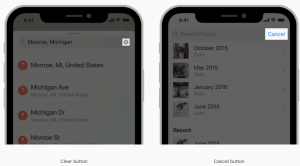
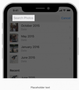
Clear button, Cancel Button and Placeholder text. From Apple.
8. Tab Bars
A tab is on the bottom of the screen and allows people to switch to different sections.
(1) Hidden when a keyboard is displayed.
(2) Translucent but may have a background tint.
(3) Tab bar can be used to organize the layers.
9. ToolBars
Is different from Tab Bars even though it is also at the bottom, Toolbars are used to perform actions related to the current view.
Design decisions overview
The screen proportion of our initial design is the same for iPhone 6/7/8. Our app is suitable for flat navigation. I have chosen green as the app’s basic colour because green ‘is associated with meanings of growth, harmony, freshness, safety, fertility and environment.’ (Color Meaning: Meaning of The Color Green, JANUARY 25, 2011 JENNIFER BOURN).
There are four sections in our application: Explore, My Activities, Messages and Profile.
Flat Navigation
Introduction to page layouts
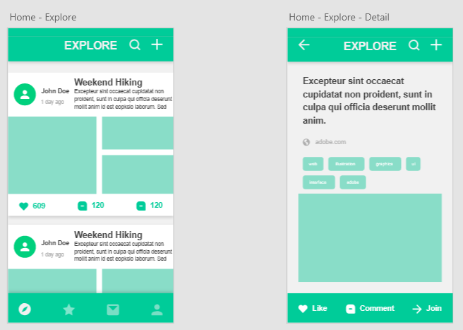
1. Explore
Explore is the home page of our application, which provides the groups or activities the user may be interested in. These group/activities are recommended by the system based on the user’s location and interests. The cards on the page show the group leader or activity sponsor, the name of a group or activity, an introduction to a few sentences, and photos.
The plus button on the top right corner allows the user to join or create a group or activity. The three icons on the bottom of each card allow the user to bookmark this group/activity, look/add a review of it or join it. The user also can check the full details of a group or activity by touching a card.
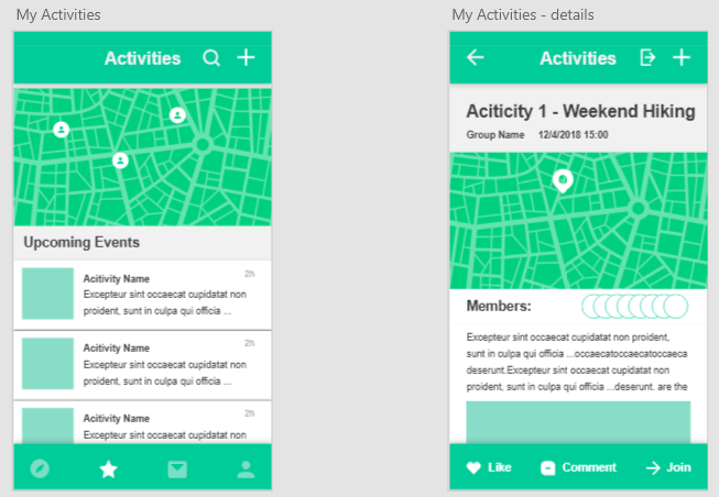
2. My Activities
In this section, the user can check their upcoming activities sorted by start time. The map shows that all the activities the user have, with pins on the map marking where they will be held. The user can touch the cards below the map to access the details page. Details pages provide the all the information about an activity: Location, members, photos.
The three buttons on the bottom are the same functions as in the Explore section. The only difference is an Exit icon on the top right corner, that allows the user quit the current activity.
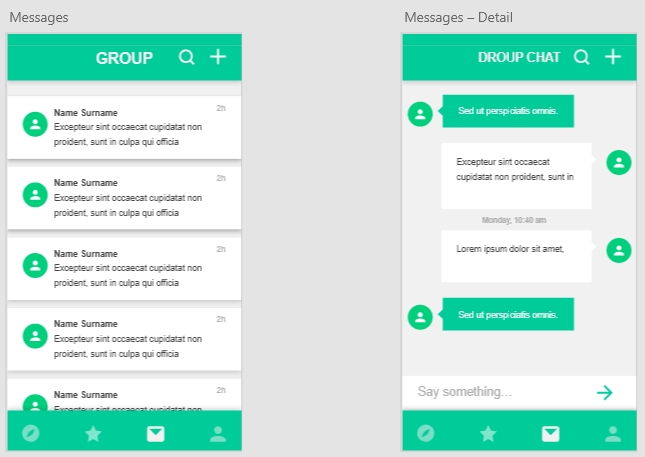
3. Messages
This section also could be as ‘Group’, which shows all the chatting information of the user. In the next version, I will further develop our identity and trust solution: where different levels of trust alter the identifiable information shown by users.
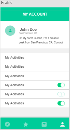
4. Profile
This section is where users can edit photos, intro, interests etc. and alter their privacy settings.